HI, I'M JUDY 👋🏽
I’m a curious Product Designer with a knack for problem-solving.
My background in Cognitive Science + Psychology makes user research my superpower—I also specialize in product strategy and rapid prototyping.

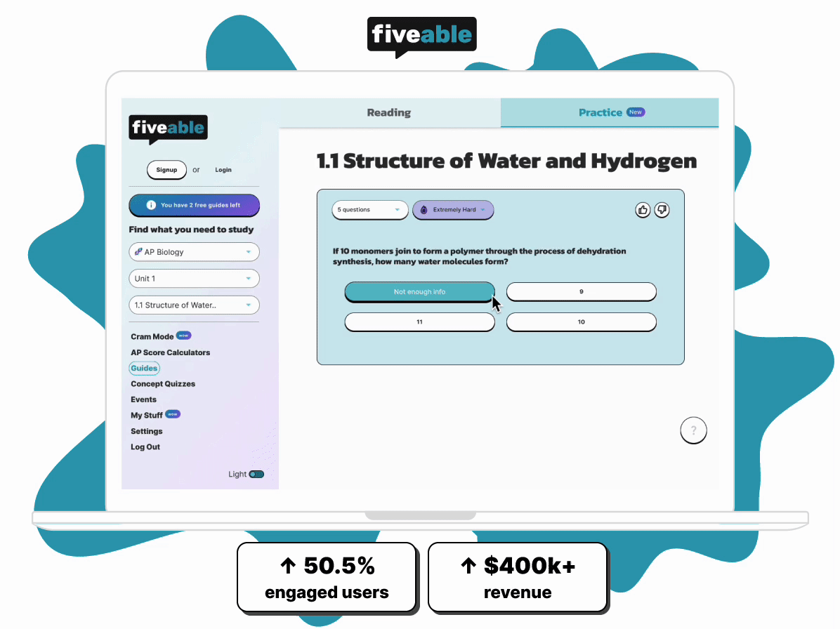
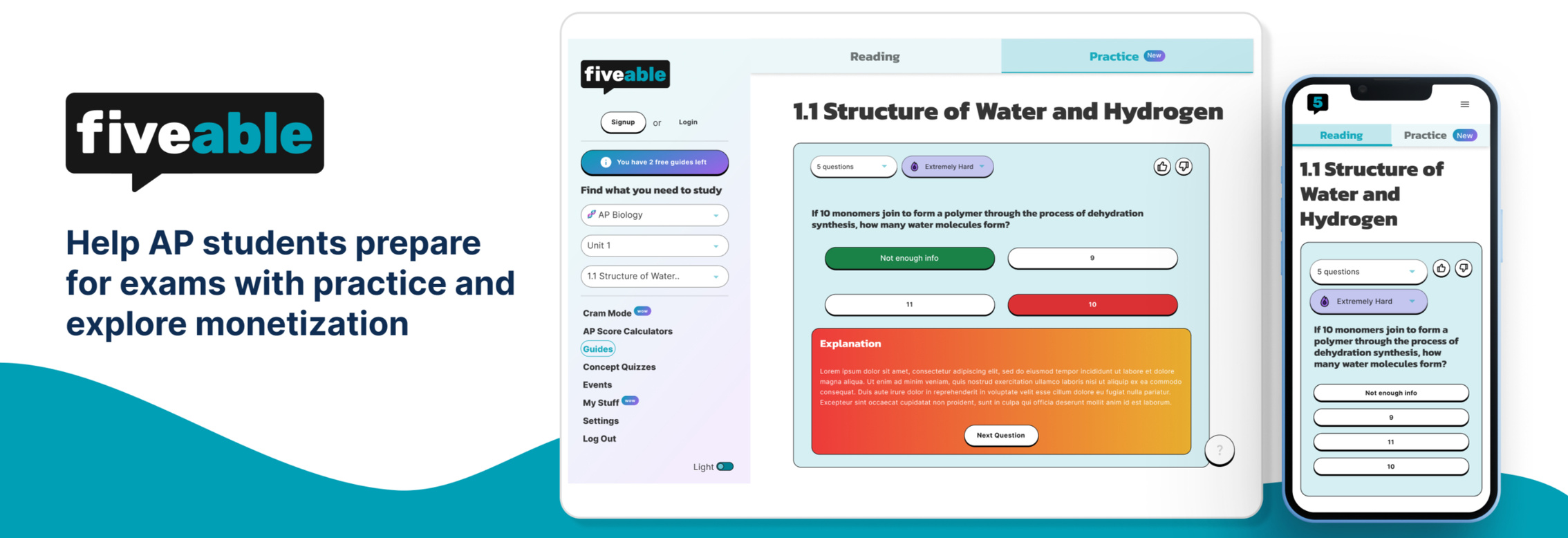
AP Practice & Revenue Experiments | Desktop/Mobile
Help AP students prepare for high-stake exams by experimenting with engagement and revenue strategies for growth

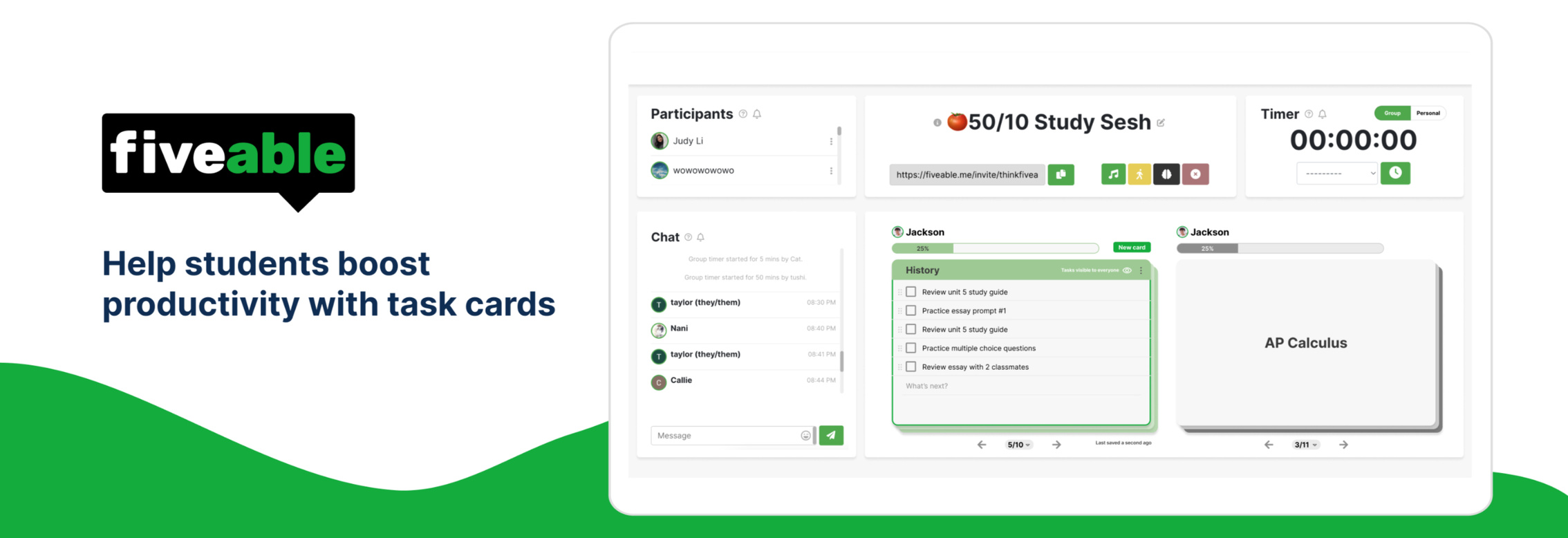
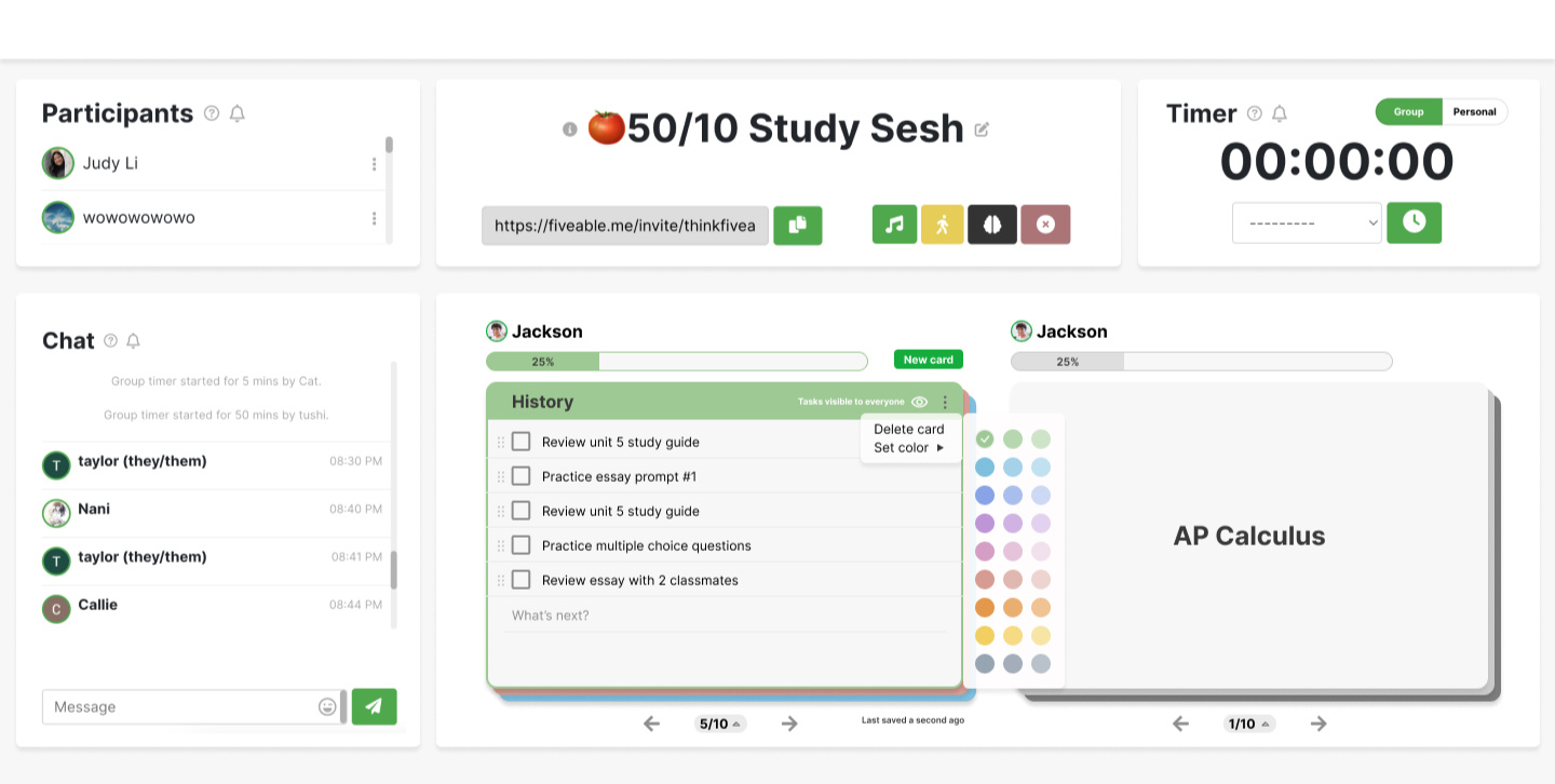
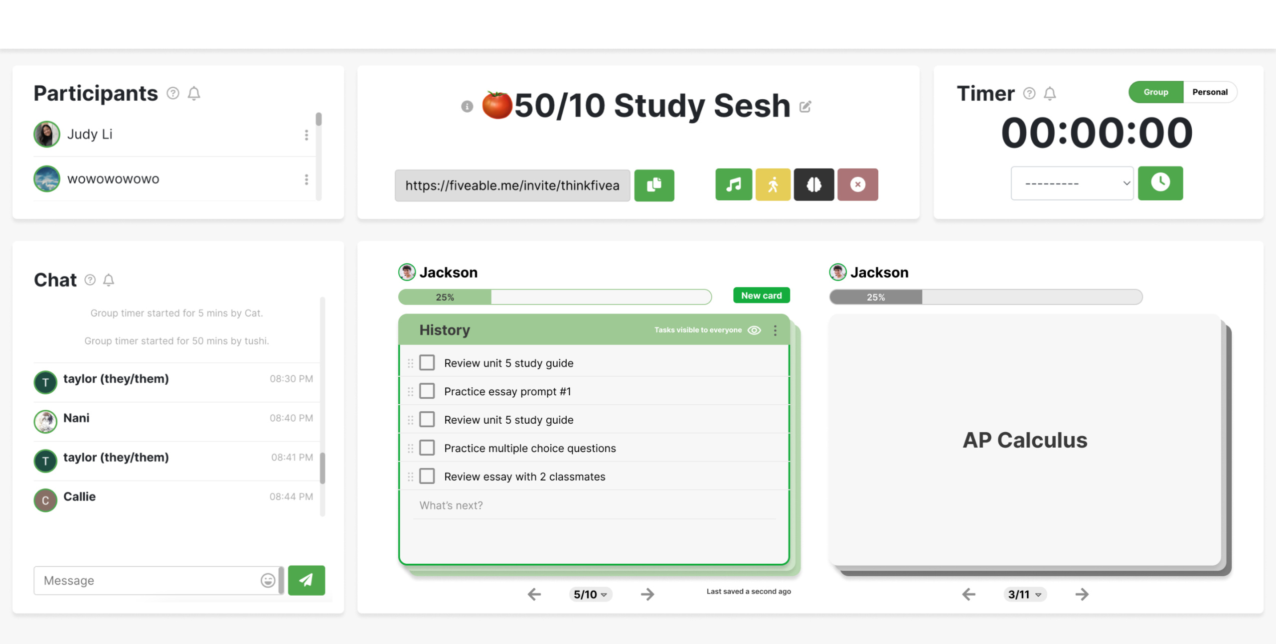
Task Cards that Boost Productivity | Desktop App
Streamline task management to improve focus and efficiency while studying
Side projects
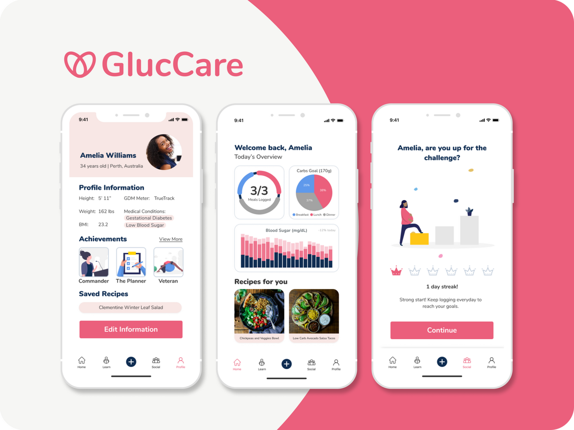
Glucare | Mobile App
Encourage pregnant mothers with Gestational Diabetes to track their food intake

Zoom | Desktop App
Redesigned to streamline and centralize Zoom’s invitation and scheduling flow
HEY THERE 👋🏽
Being a first-generation Chinese American taught me to embrace cultural nuance and diverse perspectives—values that fuel my passion for inclusive design.With a background in Cognitive Science and Psychology and hands-on experience in fast-paced startups, I create thoughtful solutions that resonate with real user needs.Most recently, I served as a Product Designer, Team Lead at Fiveable, an edtech startup helping students prepare for high-stakes exams. There, I collaborated with cross-functional teams to transform user insights into accessible learning experiences.My UX journey began with an apprenticeship at BRIDGEGOOD where I discovered my passion for user-centered design and deepened my commitment to designing for social good.

My design philosophy
| Simplicity & delight | Product-first mindset | Creative collaboration |
|---|---|---|
| I aim to make things simple but not at the cost of functionality. Thoughtful micro-interactions add delight and lead to memorable experiences. | The balance between product goals, user needs, and business objectives creates great products. I focus on crafting valuable solutions that support both the product’s vision and the company’s larger strategy. | I believe the best ideas come from diverse voices. I foster close collaboration across product, design, engineering, and users to craft innovative solutions. |
Outside of work, I love...
🌎 Traveling the world & experiencing different cultures Thailand, China, Japan are in the photos 📸👉🏽🍳 Trying new food, espescially new cuisines and experimenting with unique flavors (I'm not a picky eater)🐰 Hanging out with my bunny, who is my world!🎨 Attending design events – I like to stay inspired by attending events like the Figma Conference and online events (ie. ADP List meetups/events).

AP Practice Tool | Desktop
Overview
Timeline
16 weeksRole
Lead DesignerTeam
Head of Product
Brand Designer
EngineerTools
Figma
AmplitudeResponsibilities
Product Strategy
User Research
UX Design
UI Design
Prototyping
Engineering Collaboration
Driving user growth through active learning
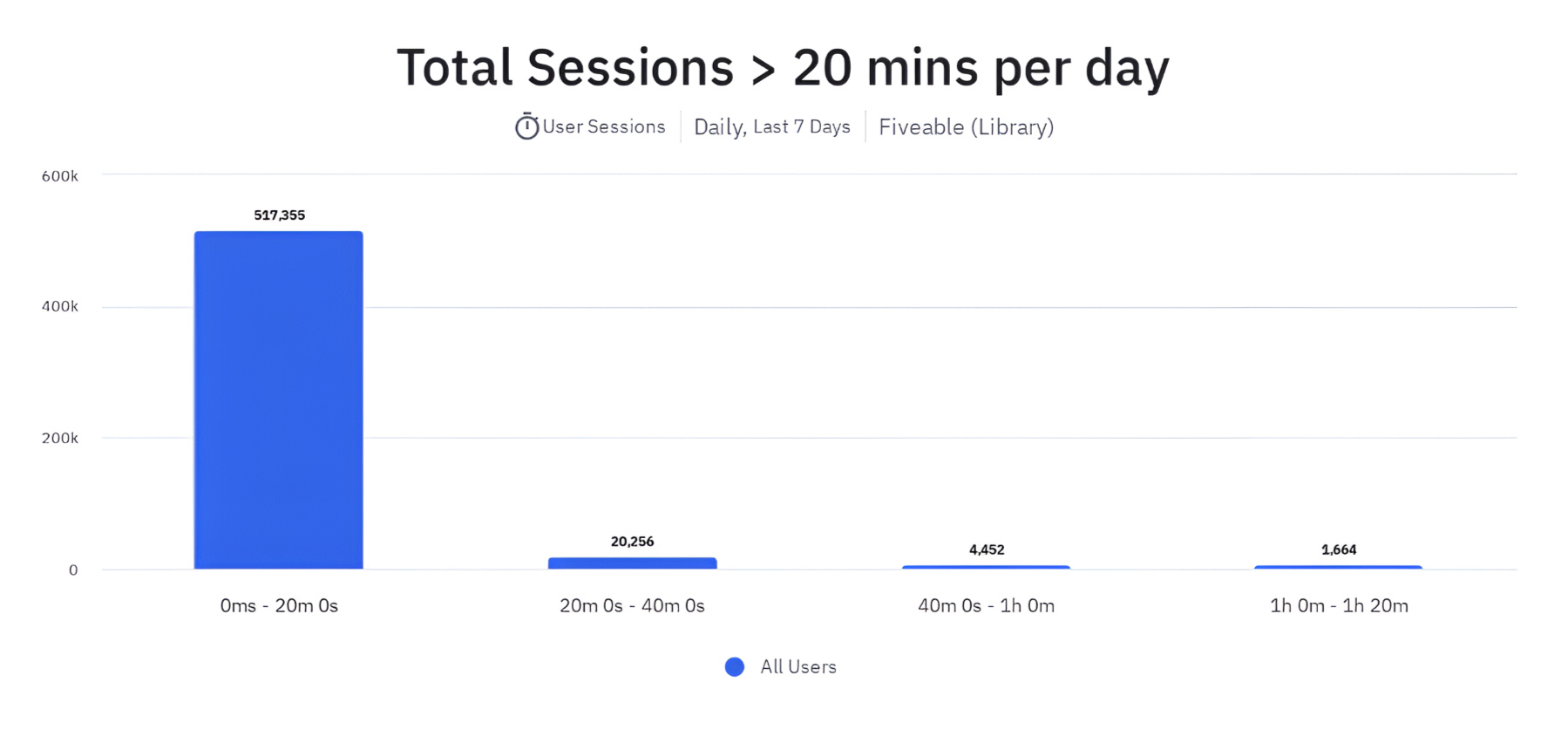
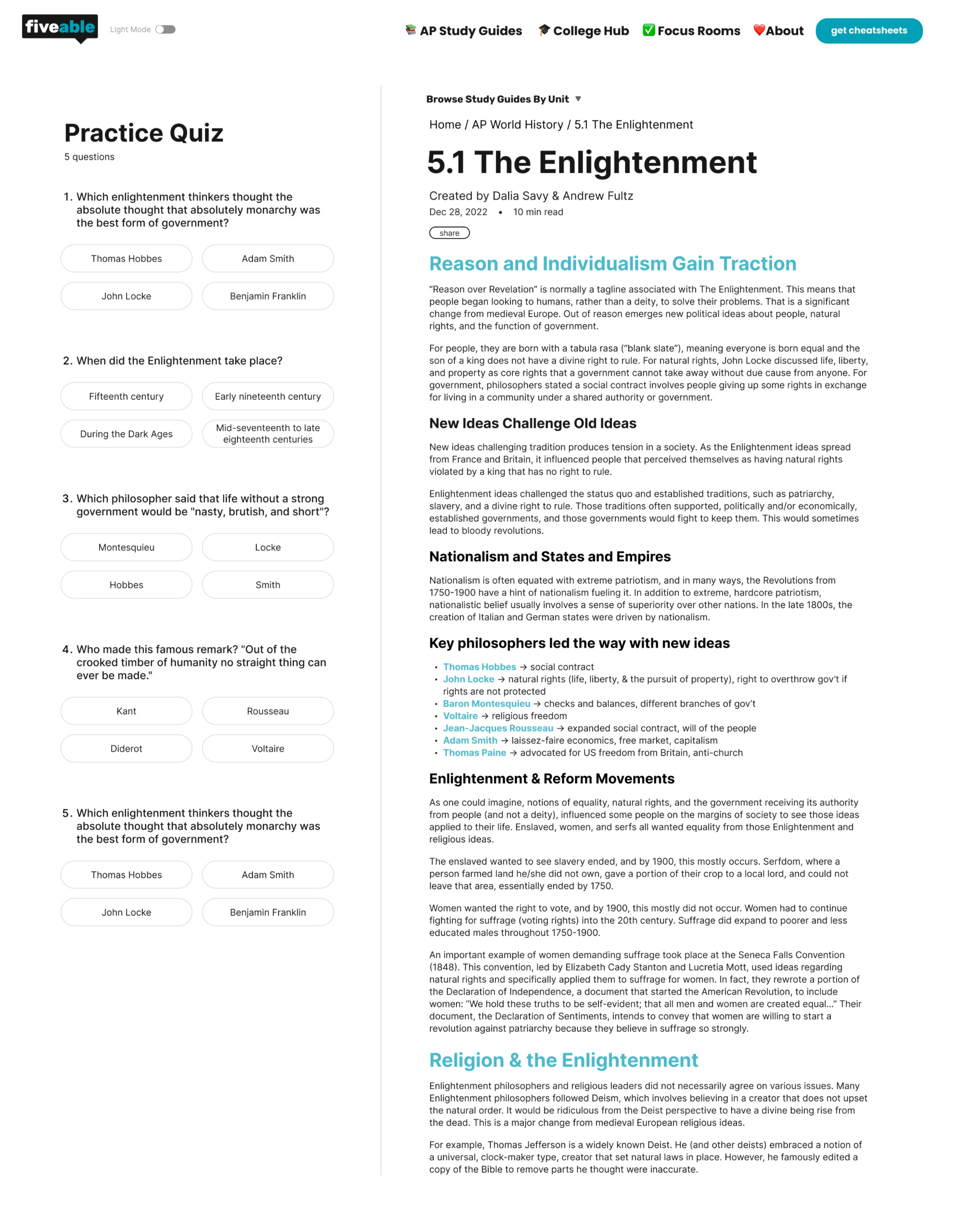
Fiveable is an AP exam prep platform, initially focused on free study guides, a passive learning tool. Only ~5% of users spend over 20 minutes per session, which is a small but engaged group. To expand this segment, the hypothesis is that integrating active learning methods can increase the number of engaged students and potentially monetize.
User Research
Interviewing AP students
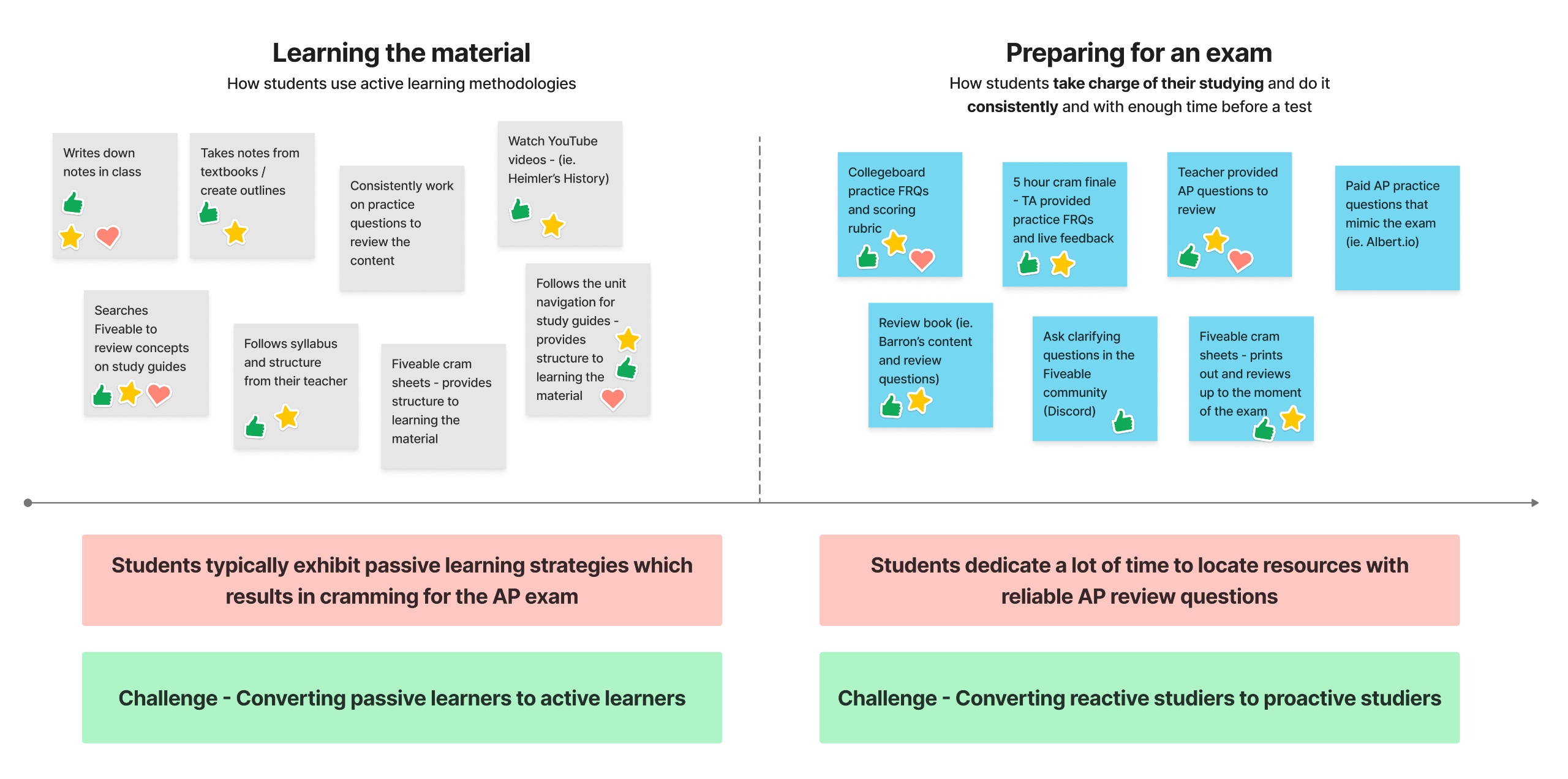
We talked to 7 AP students (3 humanities, 4 STEM) to understand their study habits.
Students value Fiveable’s study guides for cramming but they wanted challenging and application-based practice questions.
Competitors like Quizlet and Khan Academy were preferred for intrinsic motivation (e.g., achieving good grades).
Students struggled with unclear study methods for certain exam components, like essays.
User Quotes:
“I like Fiveable’s study guides, but I need to test my knowledge.”
“I use Quizlet for flashcards, but I wish Fiveable had questions like AP Classroom.”
Key Insight: Students valued Fiveable’s organized study guides but wanted more opportunities to apply knowledge through practice questions.
Problem statement
How might we help students engage in deeper, more active learning to improve knowledge retention and increase the percentage of highly engaged users (those spending 20+ minutes per session) from 4.85% to at least 6.8%?
Ideation
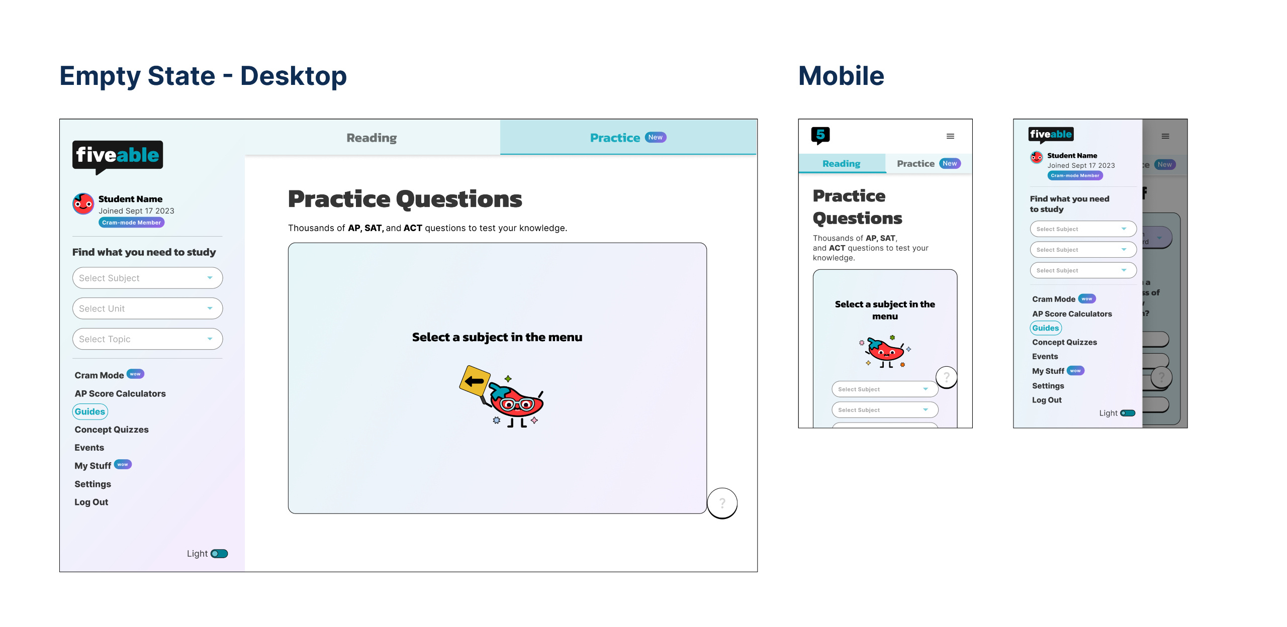
Entry point & validating practice questions
The first step was deciding where to place practice questions since they did not exist before.
Version 1: Embed practice questions into study guides
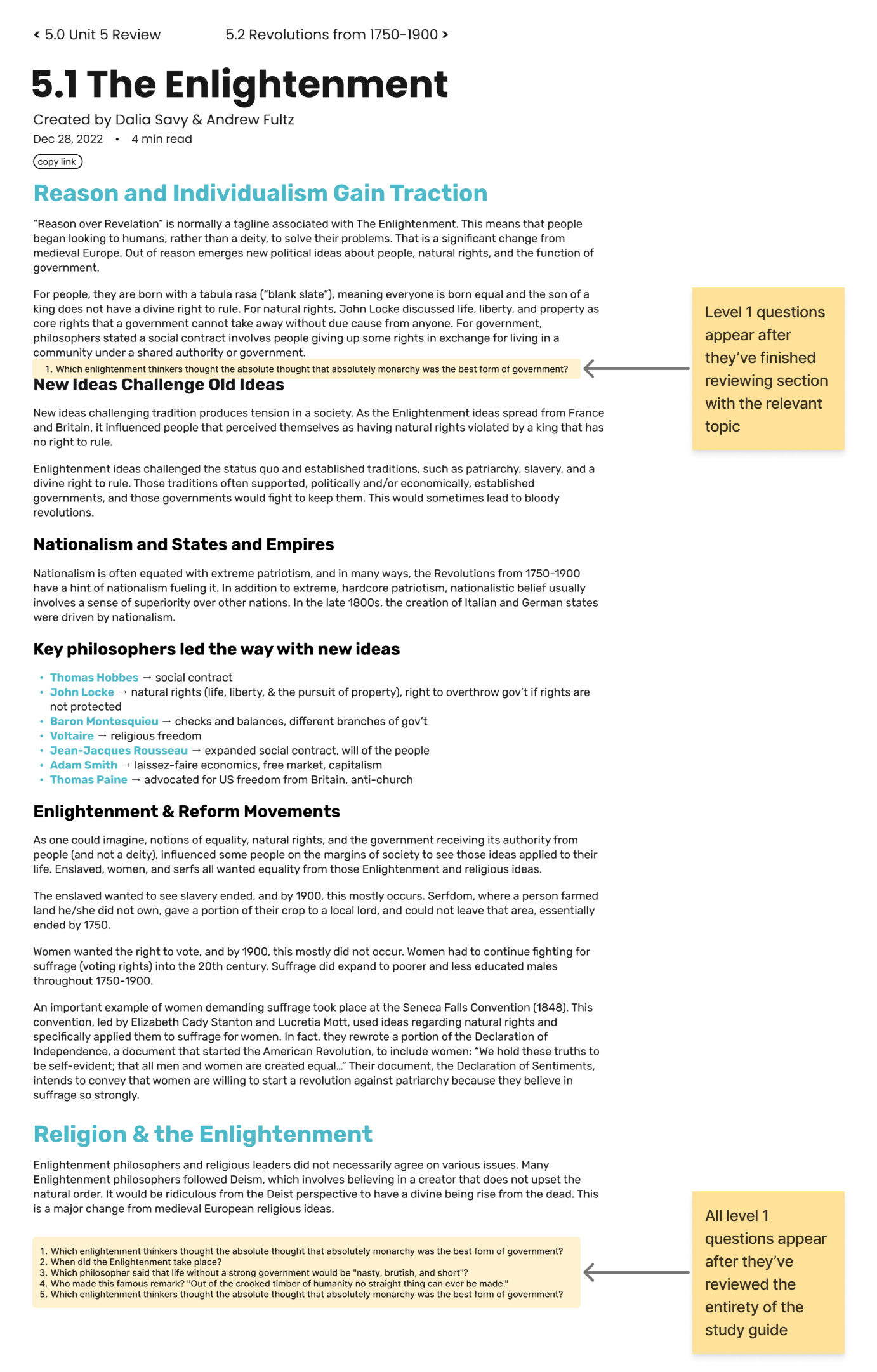
Version 2: Created a dedicated space for practice questions
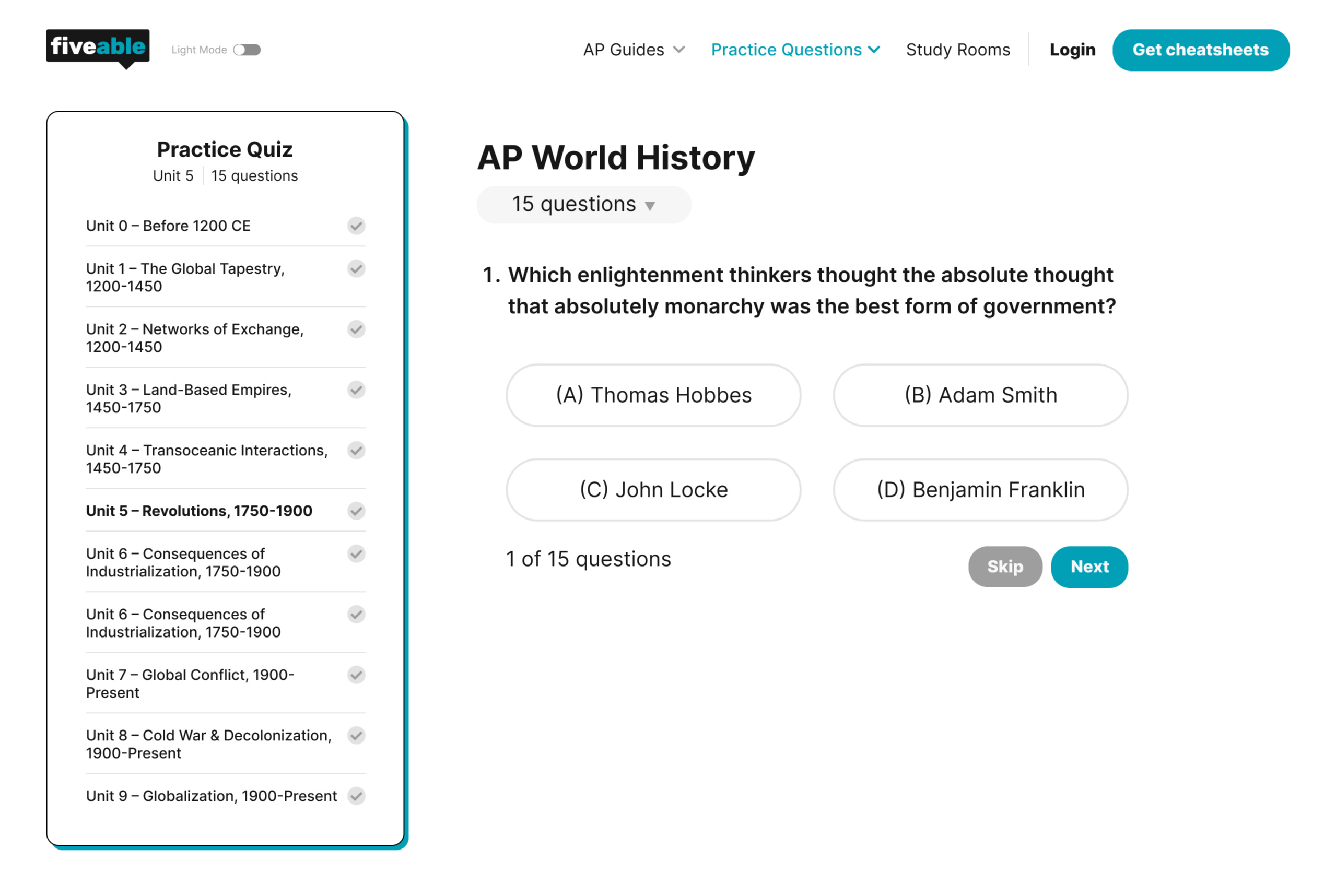
Tradeoff: Putting questions in study guides made them easier to find, but it wasn’t clear if students were there to read or practice. We had to make sure students were intentionally seeking out practice questions and see if it actually brought more traffic. So we decided to proceed with version 2.
Results: Within the first month, over 72% of DAU (averaging 400k+ students) used practice questions, showing they were a valuable feature.
Design Iteration
Integration with study guides
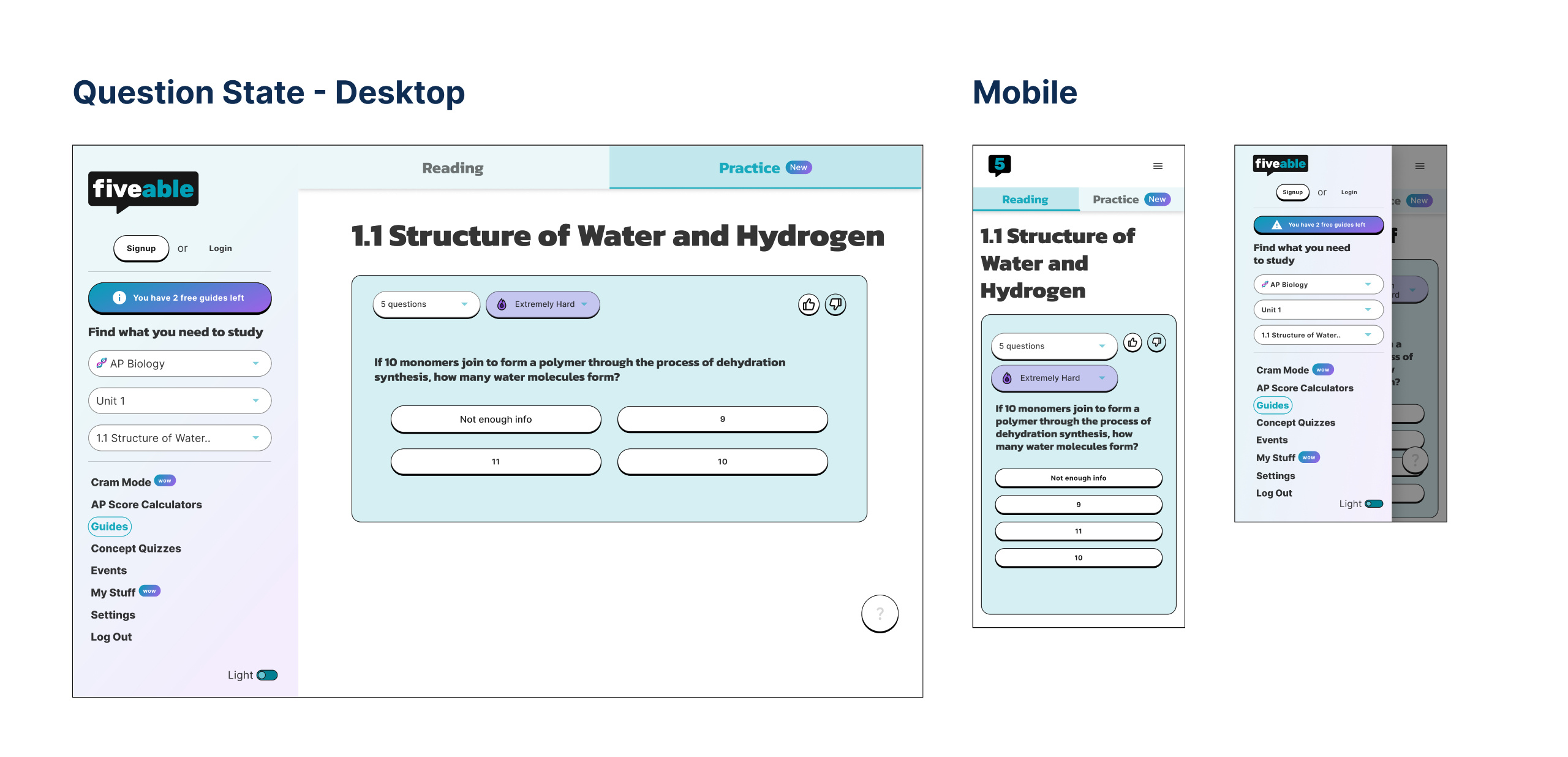
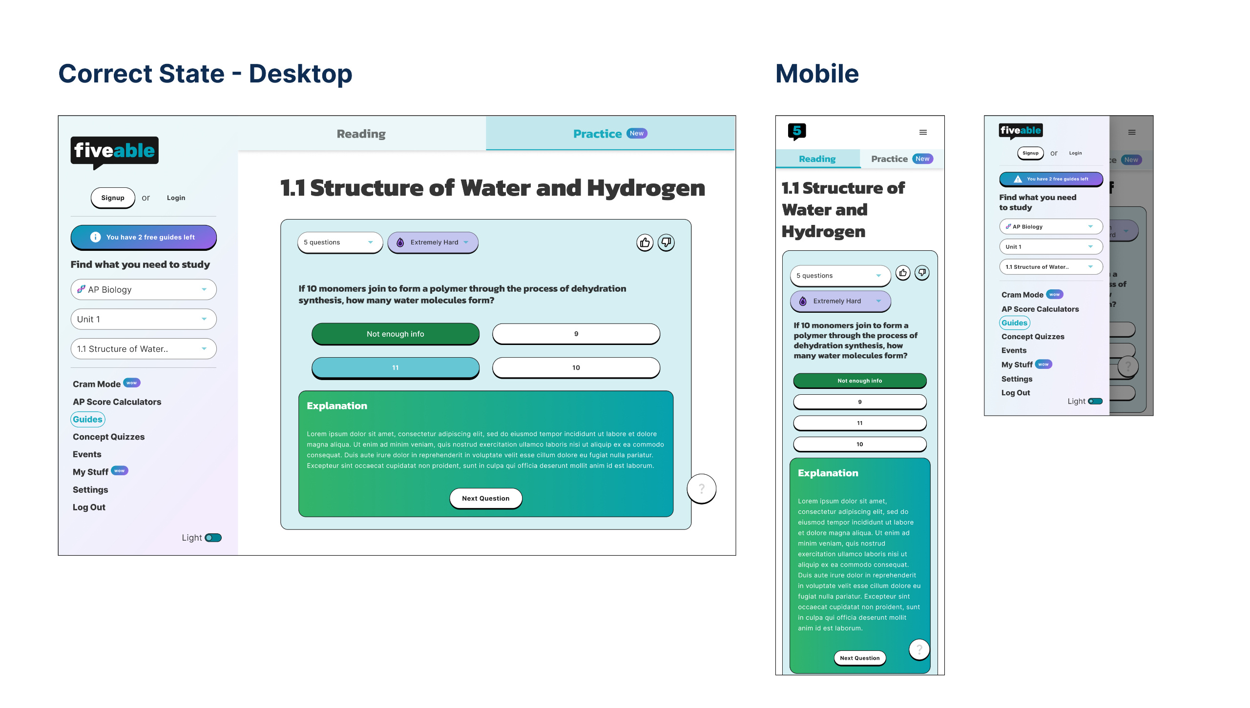
Since students primarily accessed the platform via study guides, we experimented with ways to make practice questions more discoverable than they were before.
Version 1: Added a pop-up to trigger practice questions
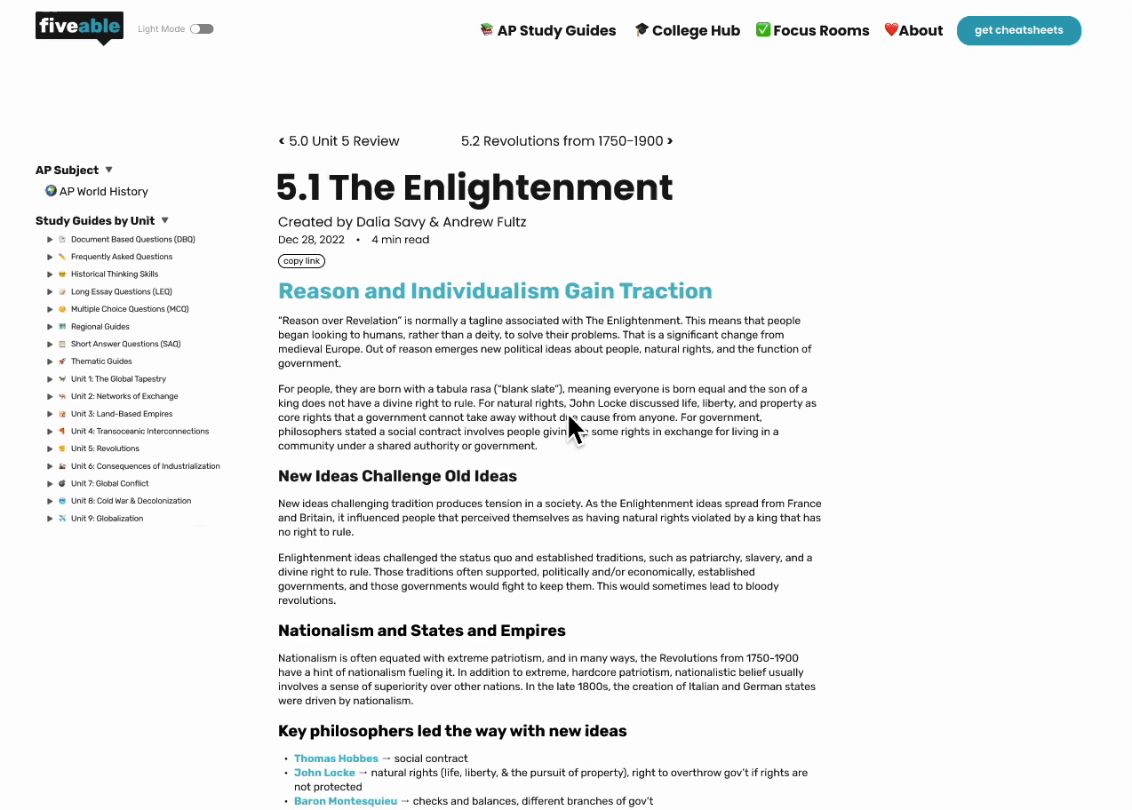
Version 2: Displayed practice questions next to study guides
A/B testing: We moved forward with version 2 because it had a 21% higher engagement rate than version 1, likely because users could interact with practice questions directly instead of dealing with extra clicks.
Monetization
Experimentation with monetization
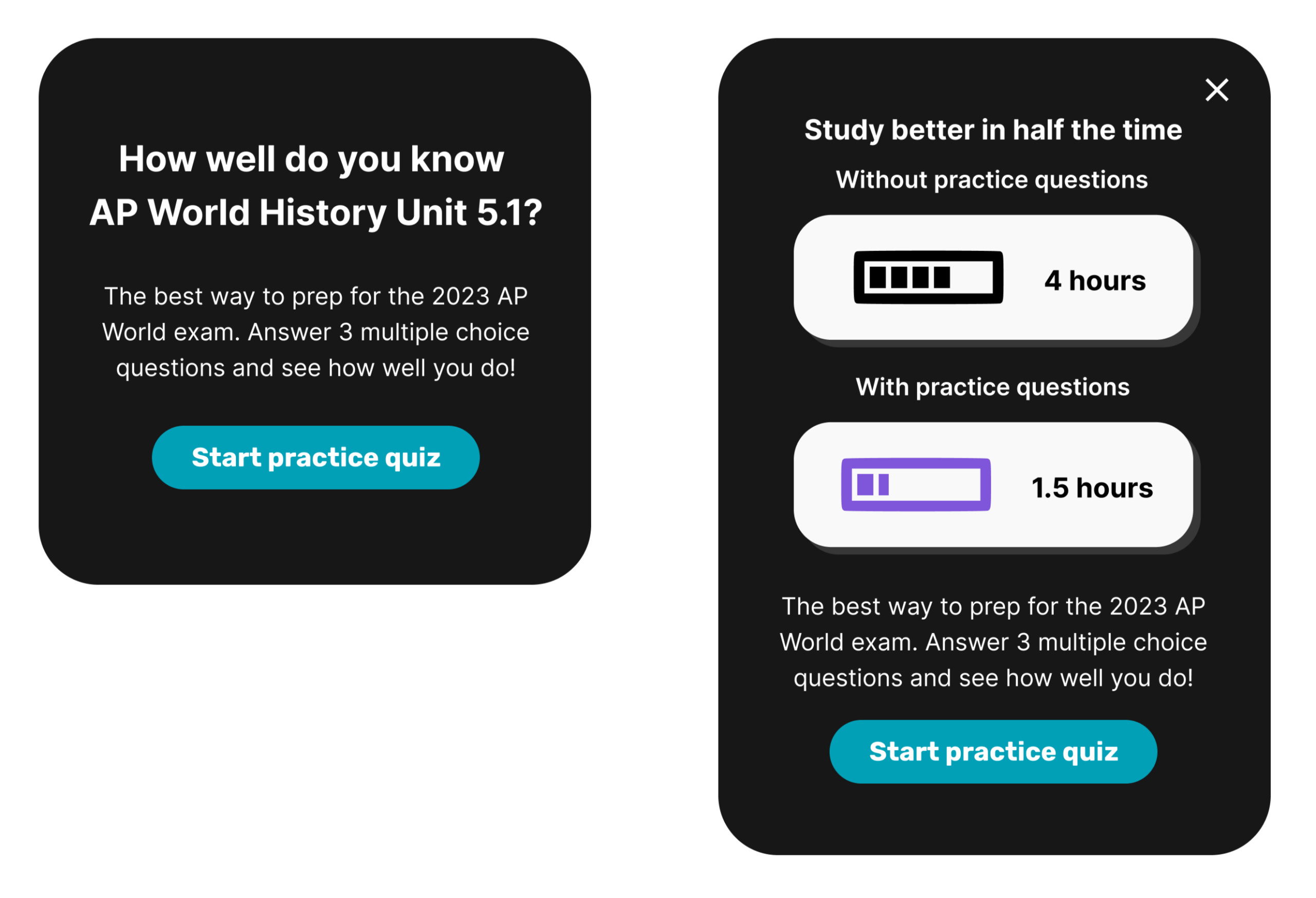
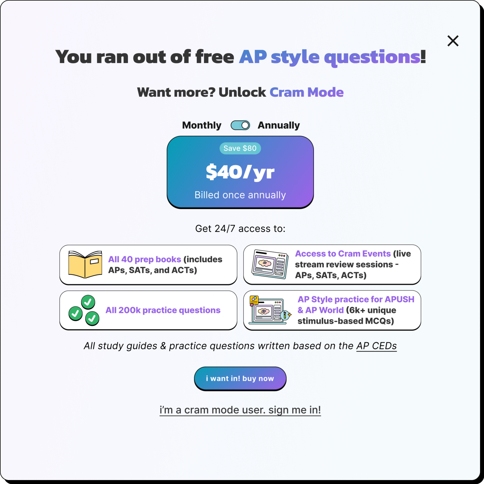
After hitting our goal of boosting highly engaged students to 7.3%, we shifted to experimentation with monetization, making practice questions the focal point.
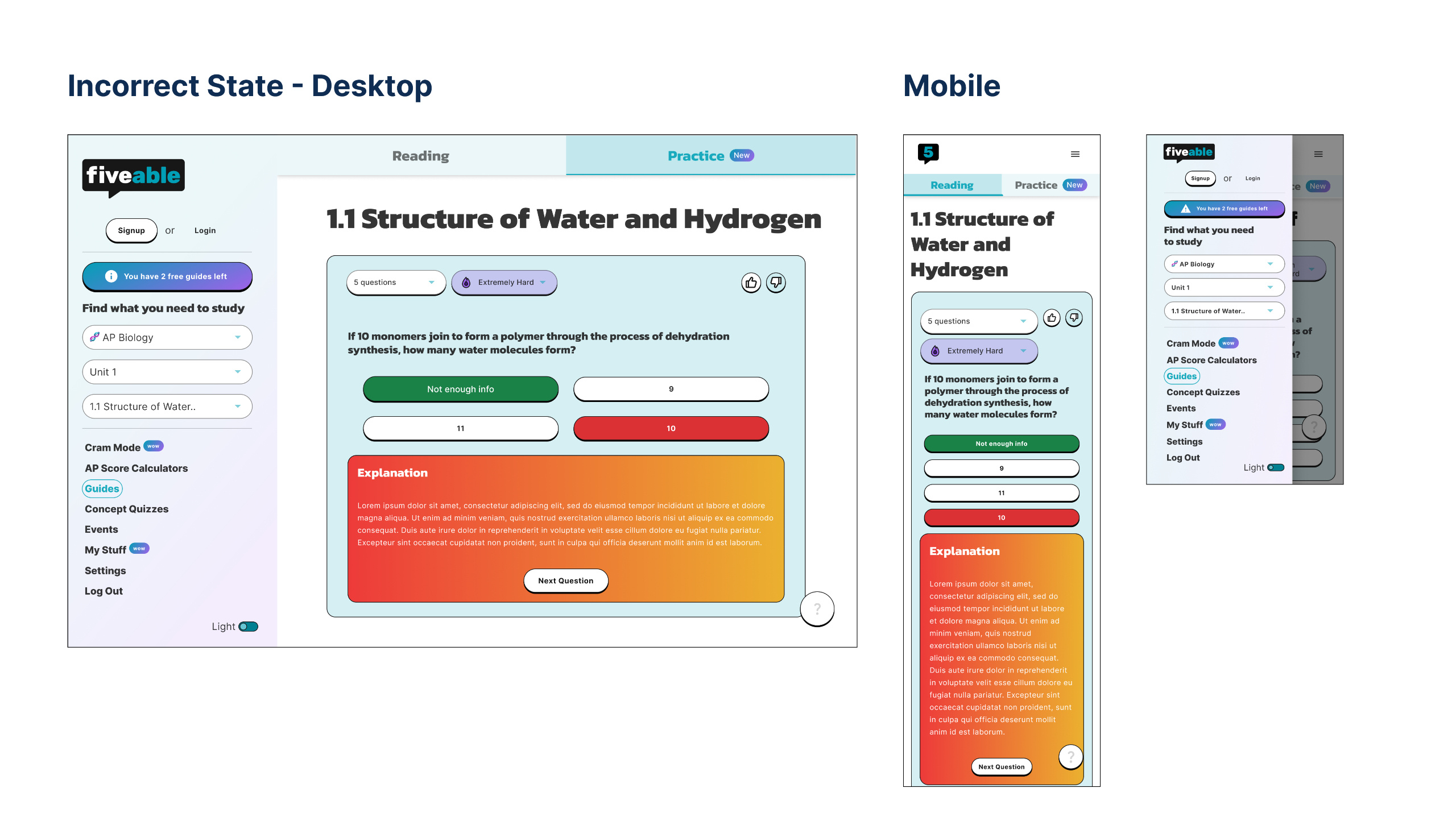
Experiment 1: We started by adding a paywall after one practice set to nudge students toward upgrading to a premium plan.
Results: In the first month of gating practice questions, we generated $2,996 in initial sales.
We were thrilled to see sales coming in. However, with only one general paywall in place, we realized there should be more opportunities to encourage upgrading an account.
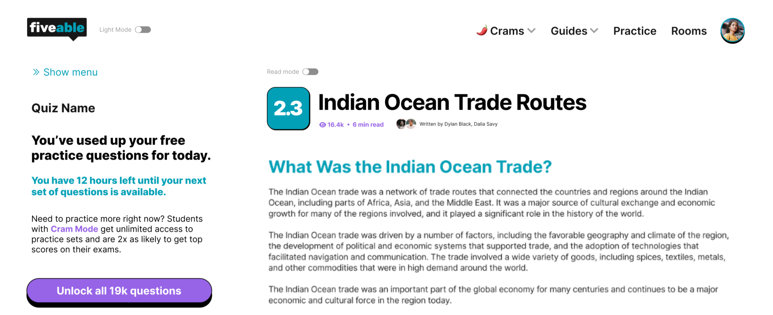
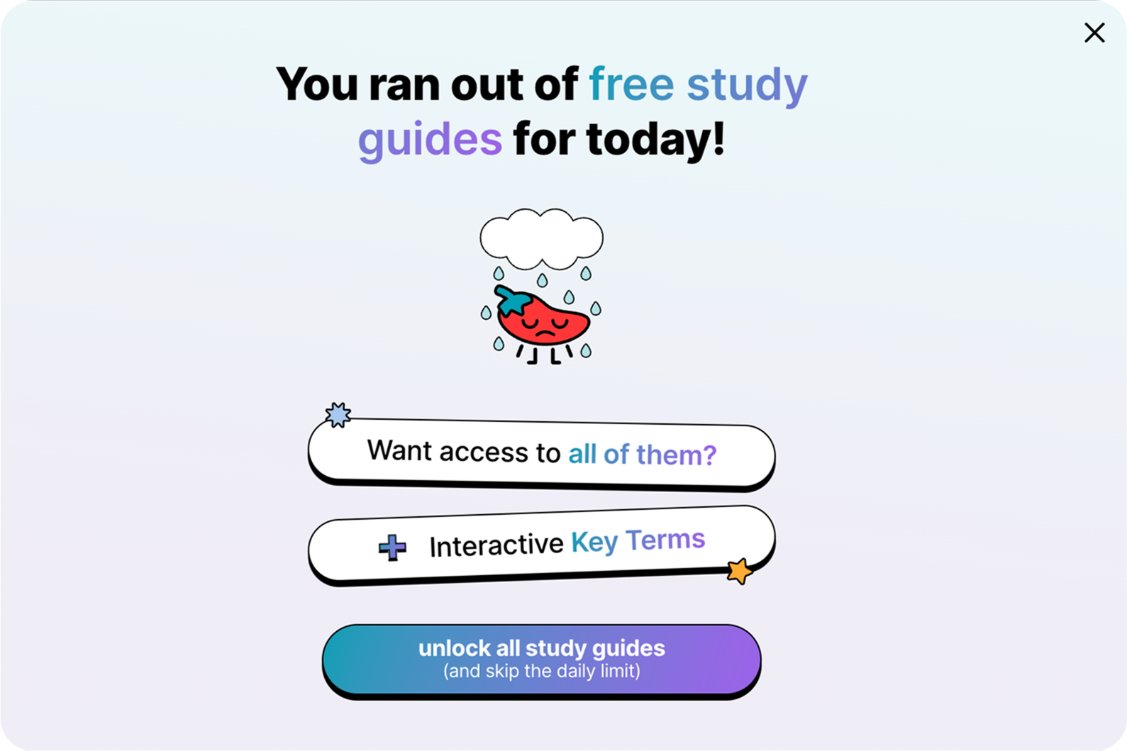
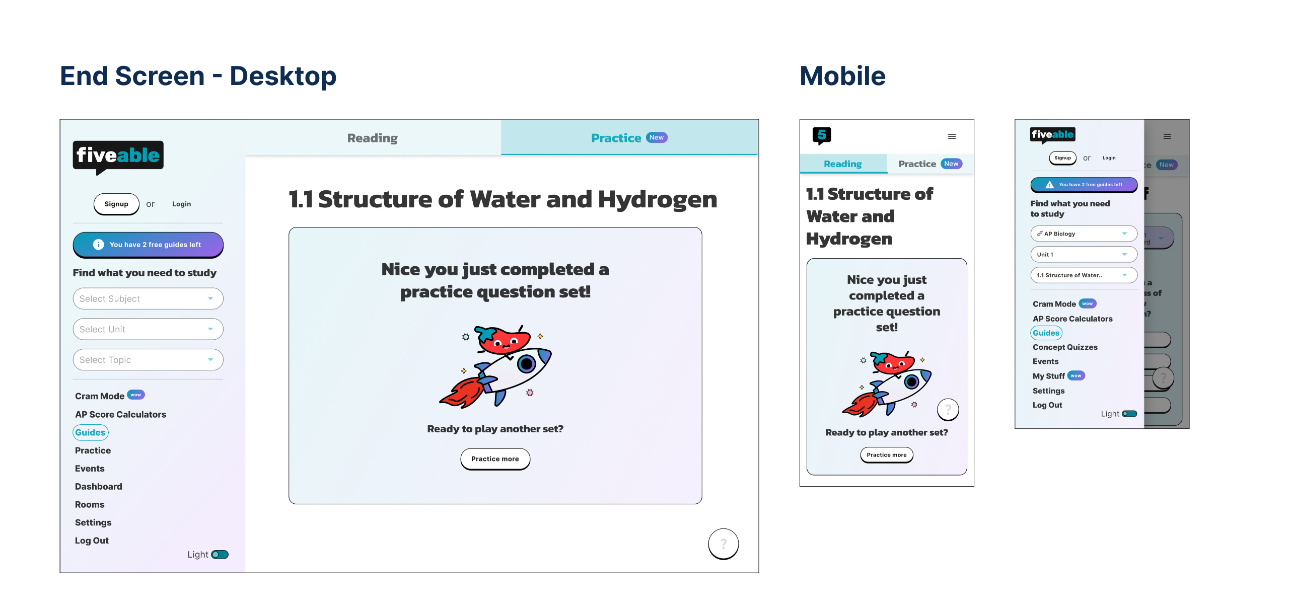
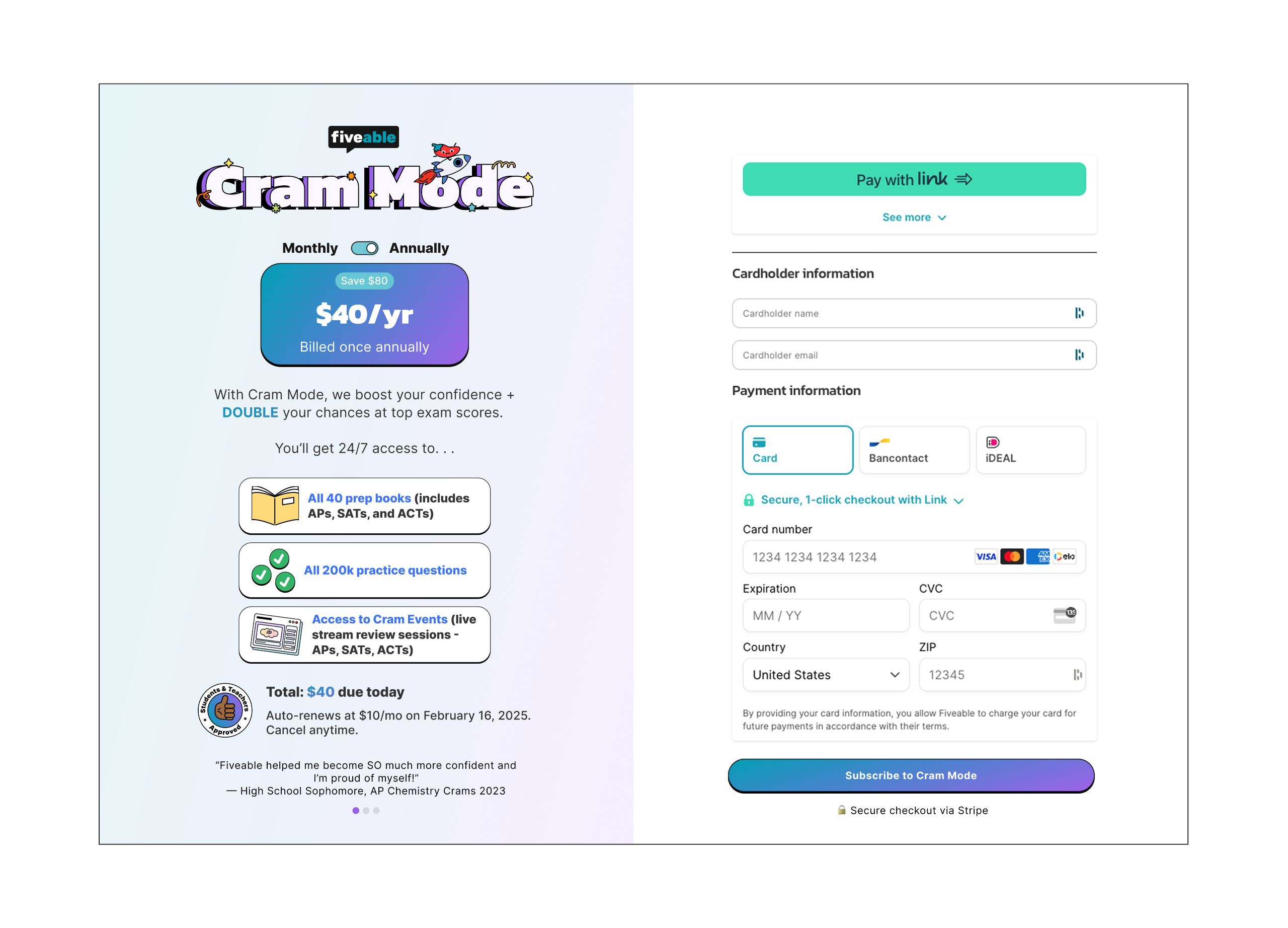
Experiment 2: We combined practice questions and study guides into Cram Mode and set an ambitious goal—to boost total paywall views on web from 140k to 1M within 30 days.
Results: Paywalls were now triggered after viewing 2 study guides or finishing 1 practice question set. While we didn't achieve our goal for paywall views, this change drove sales to $13,770 by the next month—a 359.69% increase compared to the previous month.
Experiment 3 part 1: Free trial
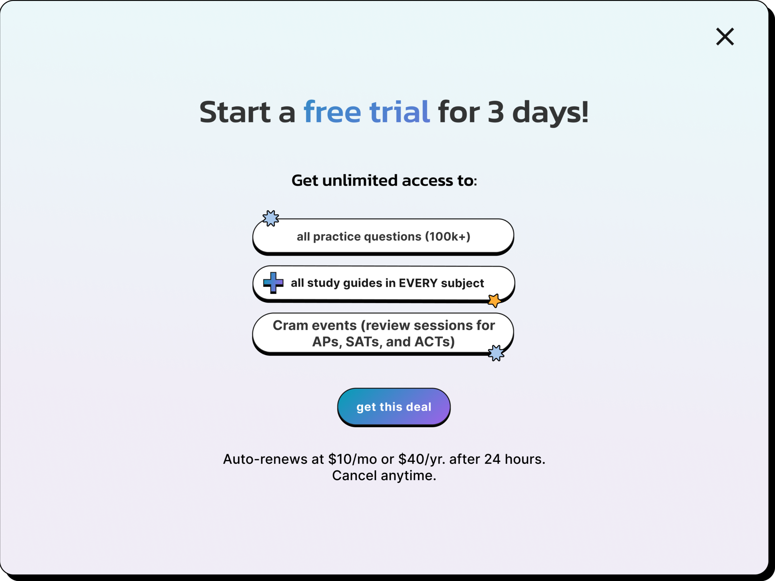
Experiment 3 part 2: Discounted membership when cancelling & pausing membership
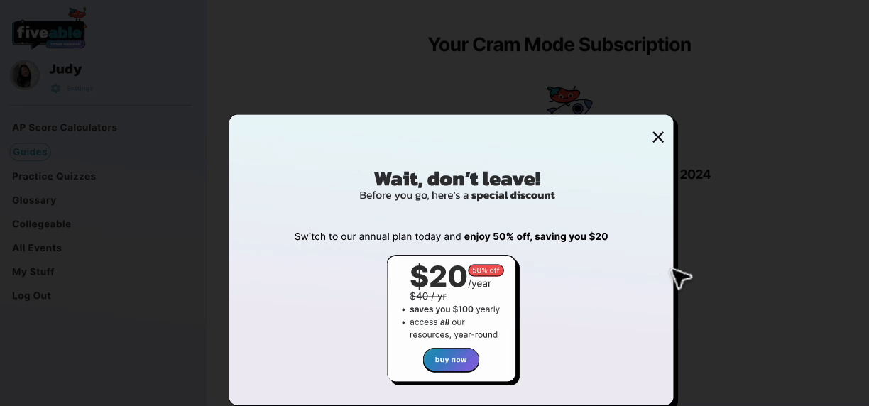
The free trial was designed to help students experience the product’s value before committing. To start, they’d enter credit card details and would be auto-charged if the trial wasn’t canceled within 3 days. If students attempted to cancel, we’d offer a discount to keep them, and if that didn’t work, they could pause their subscription during breaks like winter or summer.
Results: These changes resulted in sales jumping to $30,537 the following month, a 121.76% increase from the previous month.
Visual Branding Updates
Balancing visual overhaul
In the middle of experimentation, we welcomed a new Visual Brand Designer to our team! While it added a slight hurdle, it didn’t slow us down. We collaborated to refine the product’s design, aligning it with new branding guidelines, while I planned next steps for monetization.
Experiment 4: Updating paywalls visually & increasing conversion after the paywall. The Head of Product suggested there was potential to boost conversion rates, particularly for study guide gates (1.83%) and practice question gates (1.02%).
Validating the hypothesis with student feedback
I chatted with 7 students to test the Head of Product’s hypothesis. Key findings:
Many engaged users weren’t buying Cram Mode because money was tight for some, while others simply preferred free options. Some students also liked using physical prep books more or wanted one-time payments instead of subscriptions.
When it came to AP-style questions, students wanted them but weren’t sure where to find them. The fix was to add them into study guides or create a separate section for them.
Key takeaway: Students didn’t really get why Cram Mode was worth it, so we needed to show its value earlier.
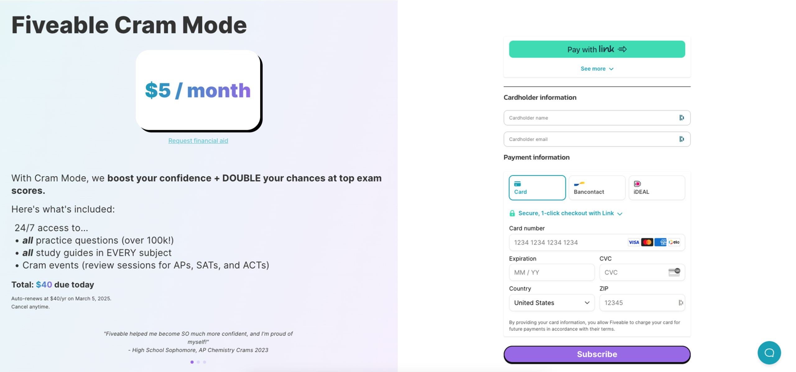
Experiment 4 (revised): Annual payment & AP Style MCQs
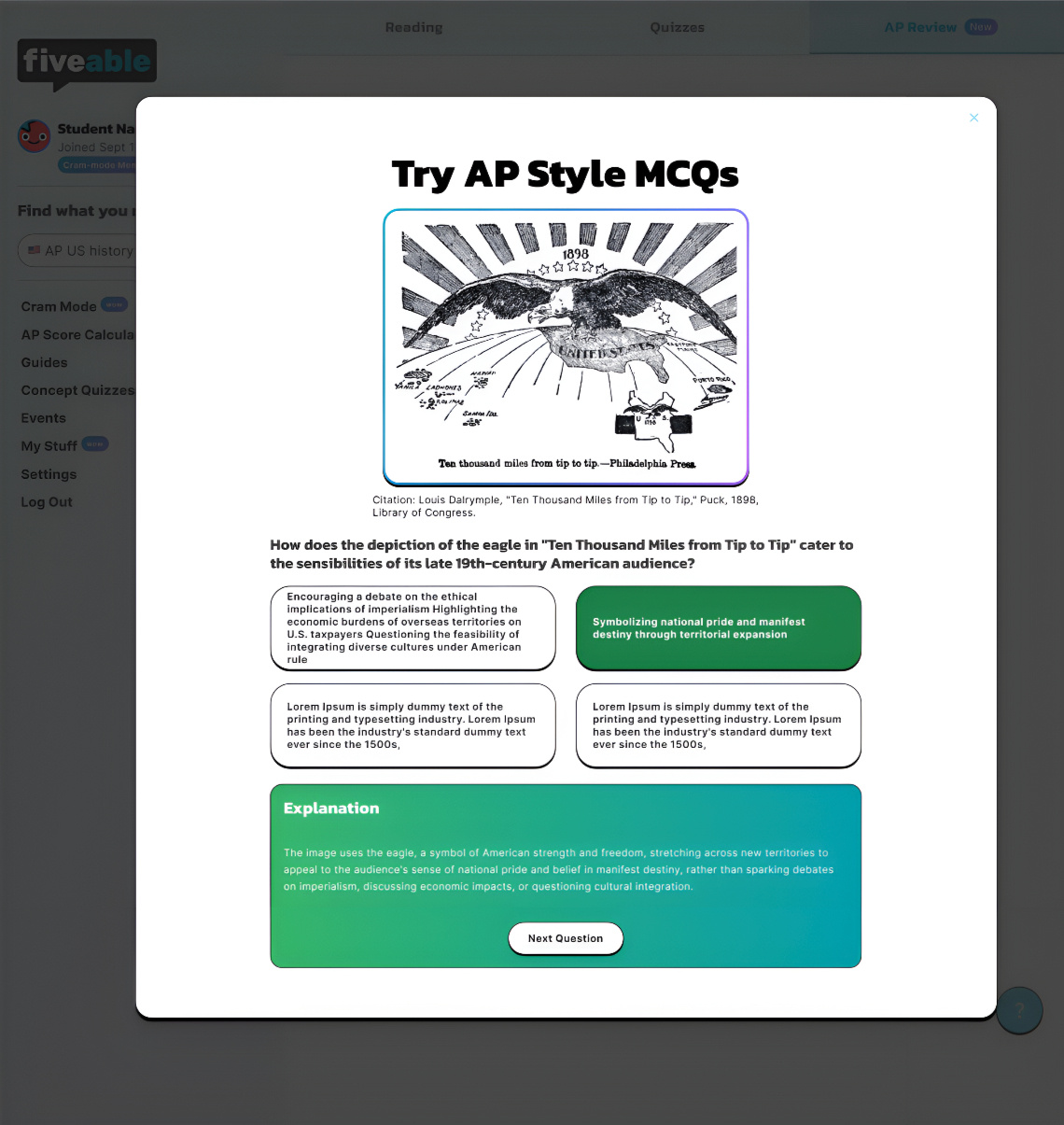
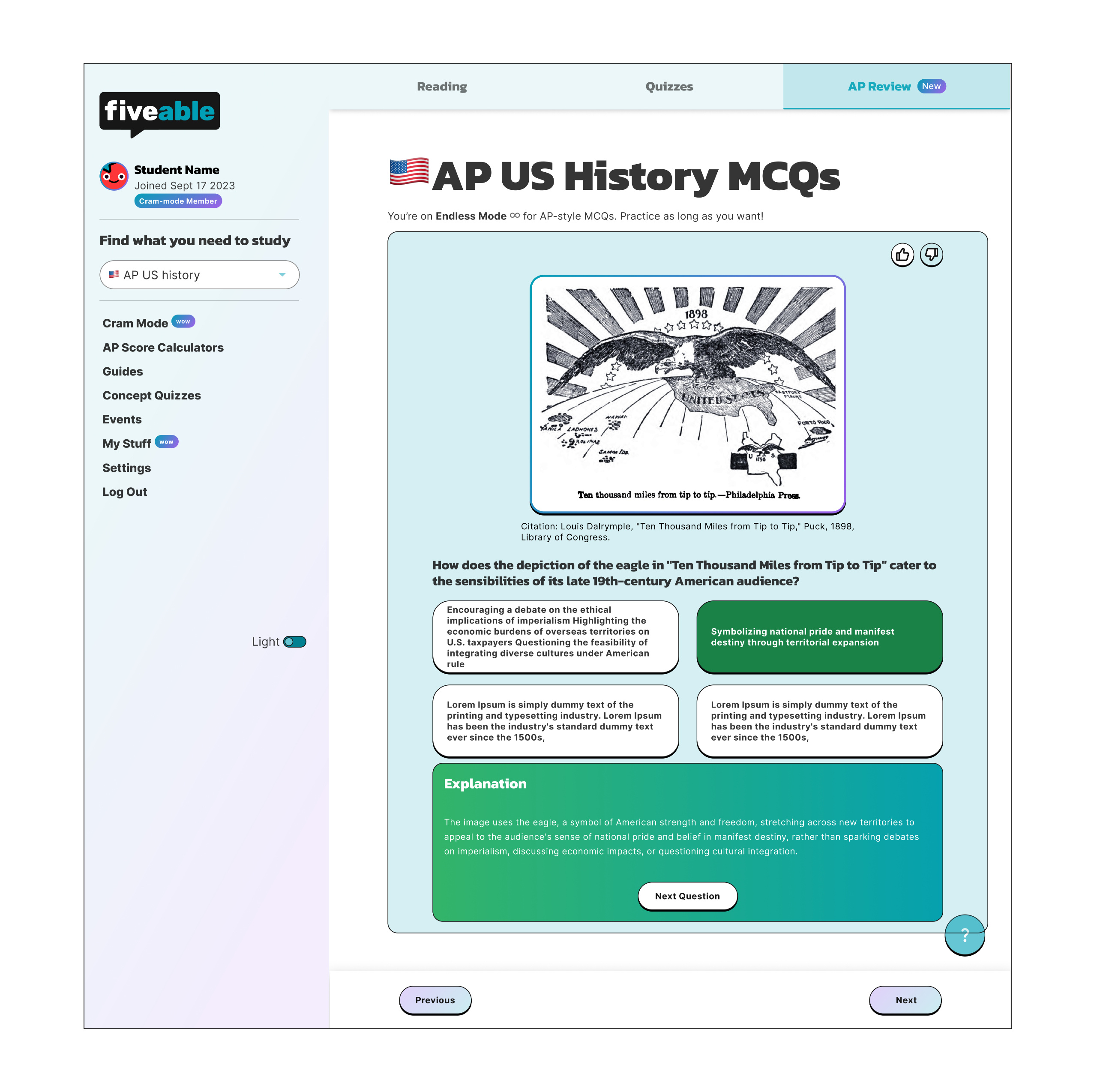
Based on student feedback, we introduced an annual plan priced at $40 instead of monthly recurring payments. We also launched a pop-up in one subject for for AP-style multiple-choice questions to better match the content and format of the AP exams. To make it easier for engineers to launch, we introduced AP-style questions to our most popular subject (AP US History and AP World History) and it was a pop-up (reusable component).
Results: These changes resulted in sales jumping to $43,546 the following month, a 42.6% increase from the previous month.
High-fidelity designs
AP Practice Tool
High-fidelity designs
AP Style MCQ & Checkout
Data Outcomes
Results: monetizing practice questions
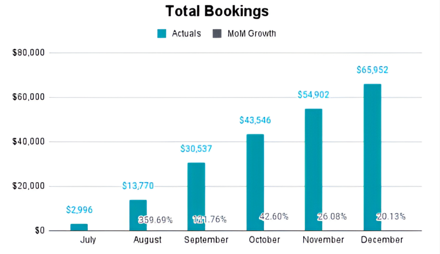
By integrating and monetizing practice questions, we saw sales (total bookings) grow month after month. The changes—like paywalls, annual plans, and AP-style questions demonstrated that students found value and were willing to pay.
Learnings & Reflection
What I learned
When a new Visual Brand Designer joined mid-experiment, it was a bit of a curveball, but we made it work. They focused on aligning the product with new branding, while I kept pushing monetization and testing. It taught me how to balance polishing design with fast-paced iteration.
Instead of rushing into live tests, we talked to users and quickly figured out why many weren’t buying Cram Mode. We also discovered students wanted AP-style questions but didn’t know where to find them—which became a key insight and a high-value feature.
I also learned to embrace the unknown, practice questions and monetization were new to Fiveable. We experimented with paywalls, subscription plans, and AP-style questions, learning as we went. It felt intimidating at first but it taught me to trust the process and stay adaptable.
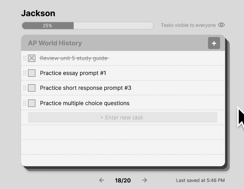
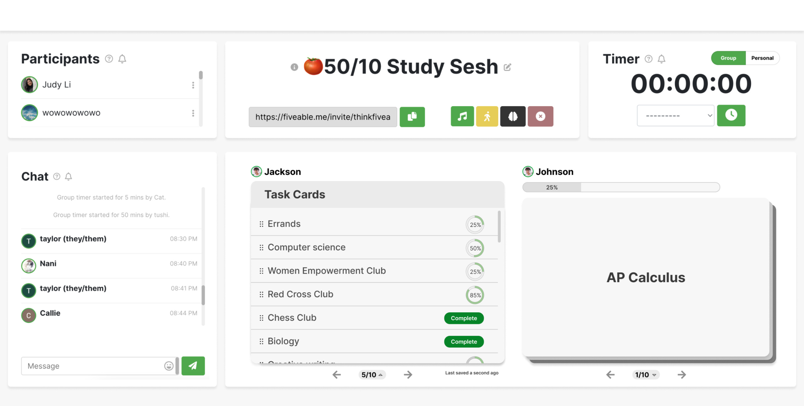
Task Cards | Desktop
Overview
Timeline
4 weeksRole
Lead DesignerTeam
Engineer
Head of ProductTools
Figma
AmplitudeResponsibilities
Product Strategy
User Research
UX Design
UI Design
Prototyping
Engineering Collaboration
Tackling cognitive overload with tasks
This project started by analyzing user feedback and data trend related to tasks. Feedback from 15 students (aged 18-25) revealed that long task lists (50+ items) feel overwhelming. One student said, "I lose track of what I need to do because my list is long."
Original task list (before any design changes)
We also found that task completion drives retention—users who finish over 100 tasks in 90 days stick around the longest. How can we use design to help students stay productive without feeling overwhelmed?
Design Brief
Reducing friction in tasks
This brief is focused on the opportunities related to the core task activity loop, where the hypothesis is that users are experiencing friction while organizing tasks and transitioning to a “done” state, and requesting more task management features to alleviate this.
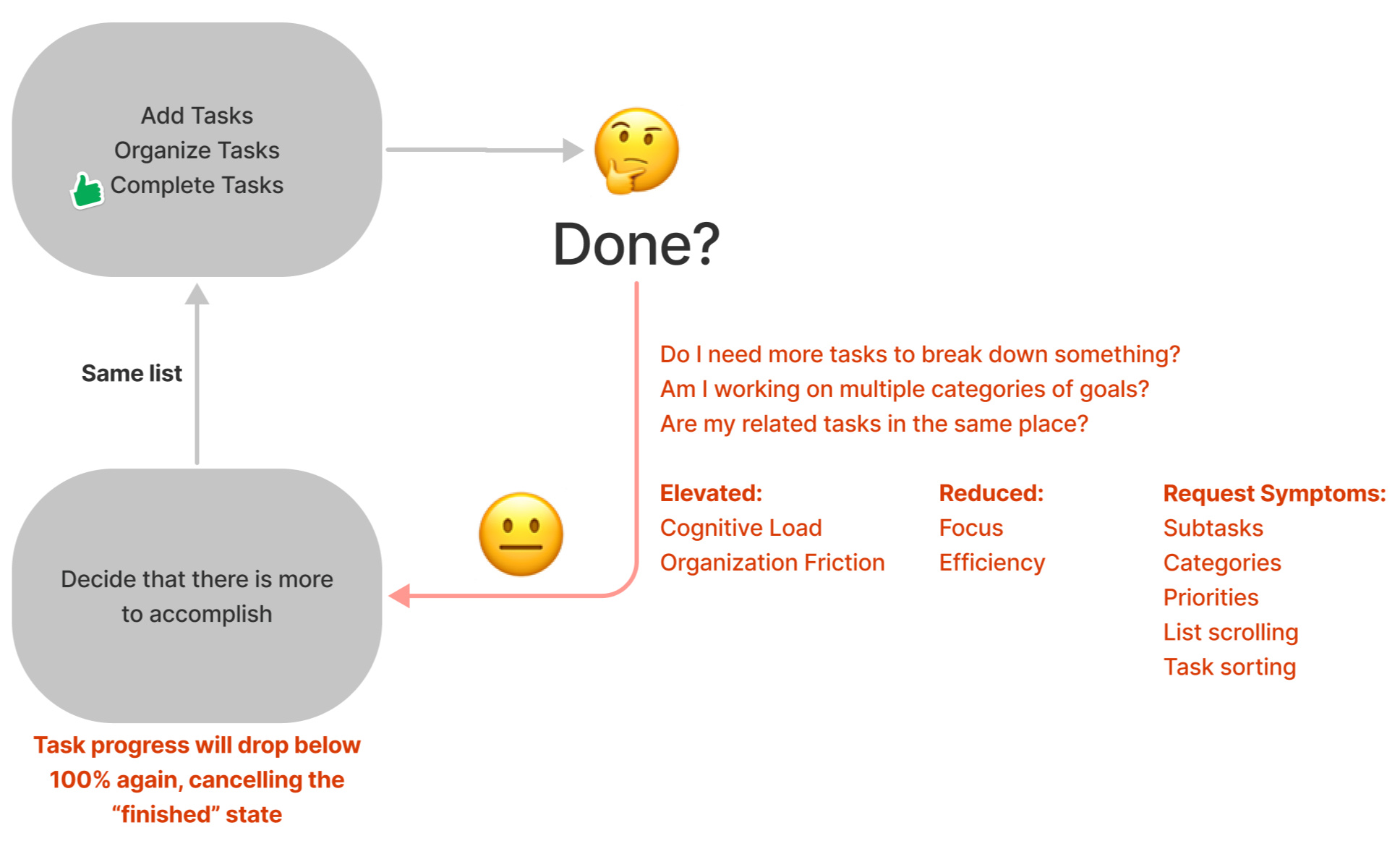
Constraints to consider
On the technical side, where users must be represented as a single unit in sessions, tasks and progress should be consolidated into a unified view for consistent data across the platform.
On the usability side, users should be able to switch between task cards seamlessly without losing their progress or interrupting their workflow.
Problem statement
How might we help students break down overwhelming task lists into manageable chunks while providing clear progress tracking and a sense of accomplishment to reduce cognitive overload and improve task completion rates?
Research & Insights
Inspiration from competitors
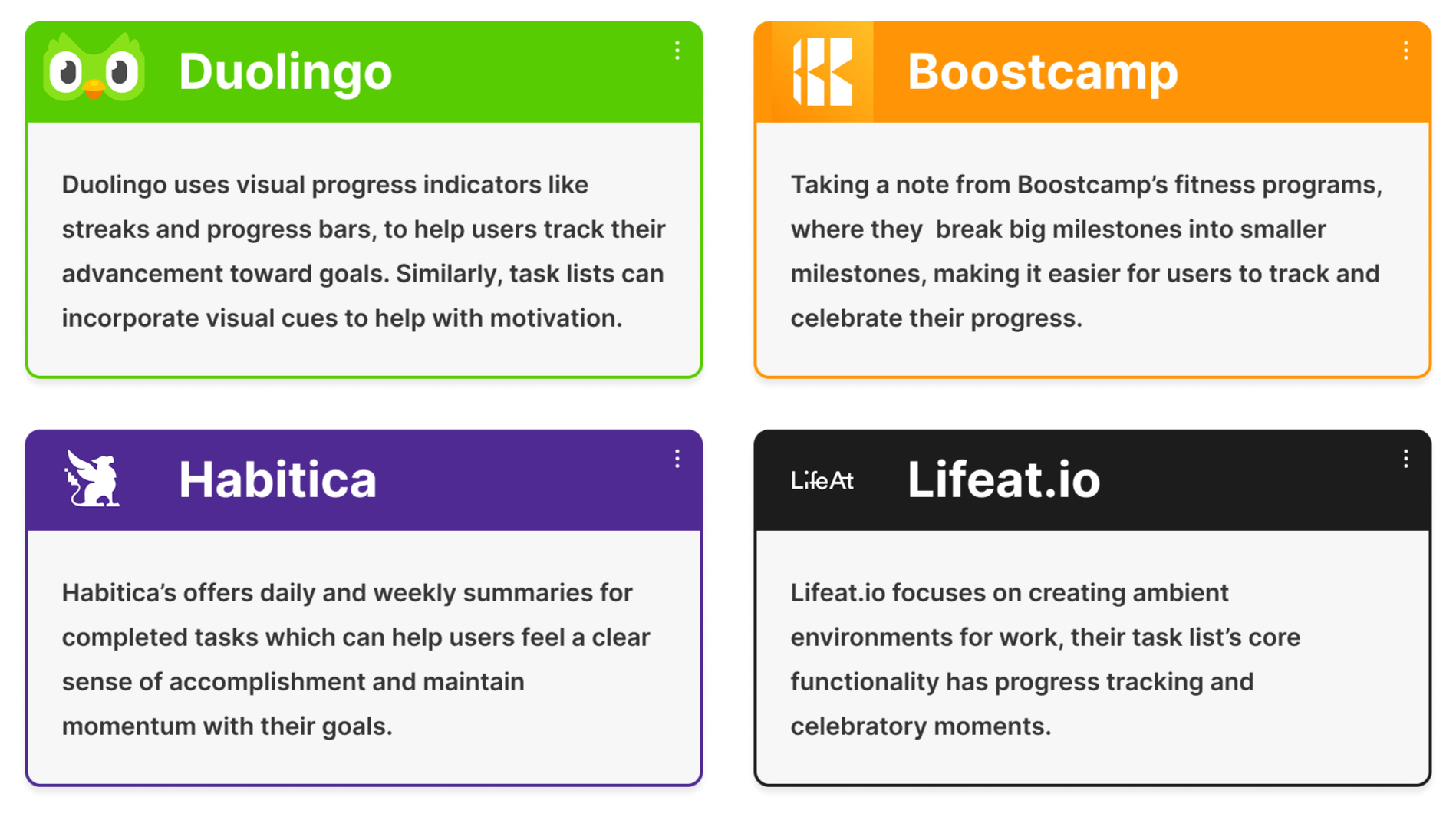
Summary:
Duolingo - Visual progress indicators (e.g., streaks, progress bars).
Boostcamp - Milestone breakdowns for tracking smaller, measurable goals.
Habitica - Daily/weekly summaries to celebrate accomplishments.
Lifeat.io - Core task functionalities for organization and focus.
Defining goals
Must-haves
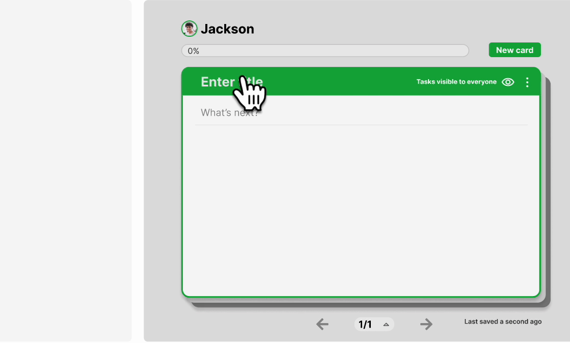
Easily create and switch between task cards.
Acknowledge progress and provide a sense of accomplishment.
Retain progress history of tasks to avoid losing completed work.
Ideation
Initial exploration
Both versions of the task cards were designed to work for both individual and group use. The goal of the design was to encourage students to break tasks into smaller, manageable steps and to organize similar tasks into categories.
Version 1: Carousel of tasks

Version 2: Deck of tasks
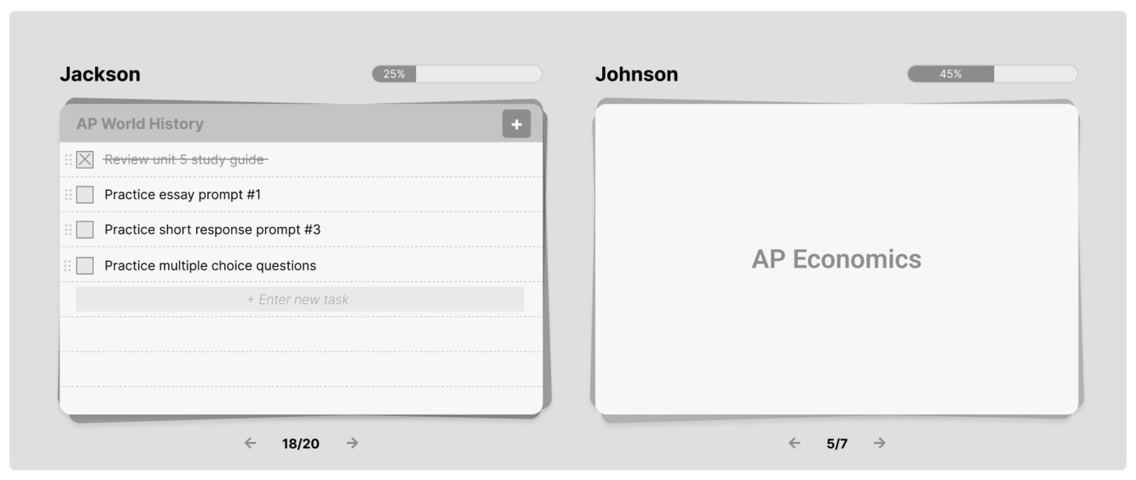
User Testing with 10 students evaluated both formats. They appreciated the carousel but it was commonly mistaken for slides, leading to confusion. In contrast, the stack format was favored by 8/10 students for its simplicity and ease of use.
Engineering Feedback: The carousel was harder to integrate, especially for mobile.
Decision: Ultimately, we chose to move forward with the stack format since it aligned with user preferences and technical feasibility.
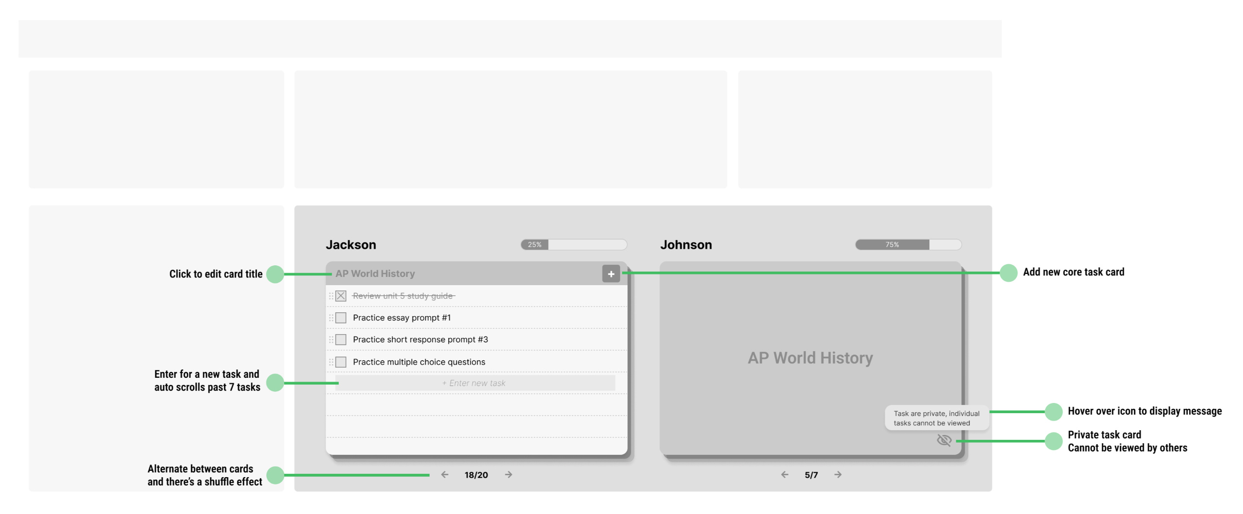
Privacy settings
Public cards let friends view all your tasks, while private cards only display the title, so you can study together without sharing private details unless you choose to.
Version 1: Private vs. public toggle
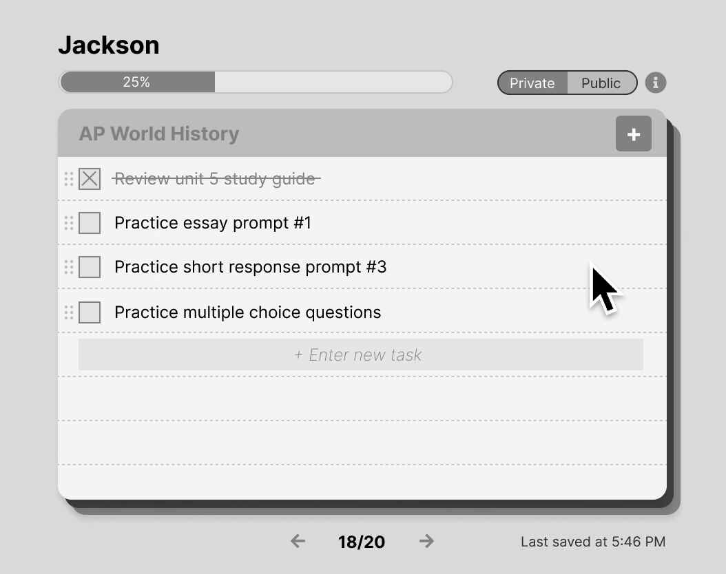
Version 2: Eye icon vs. slashed eye icon
User feedback: Majority of users found the private vs. public toggle confusing. 6/7 of users found the new eye icon design intuitive so we moved forward with this design choice.
Design iteration
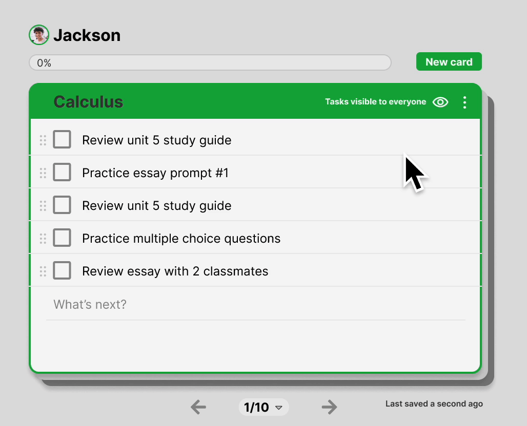
Each task card displays 7 tasks, optimized for focus in alignment with Miller’s Law (where the average person can hold about 7 (±2) items in their working memory at once).
Key Exploration: Style of task cards, progress bars and privacy settings
Feedback workshop
Gathering feedback from the internal team
I collaborated with the internal engineering, product, and design teams to conduct a feedback workshop, discussing likes, ideas, challenges, and questions related to task cards.
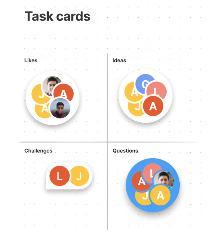
Highlights:
Is there an easy way to navigate to the bottom card of the deck?
Is there a way to see overall progress across all task cards?
Is there a notification for when tasks are saved?
Is there a way to delete an unwanted task card?
Design iteration
List view, notifications, delete option
The feedback workshop highlighted the need for an aggregate list view—displaying all task card titles—to enhance navigation and usability. Additionally, save notifications were added to the bottom-right of the task card and the ability to delete task cards were introduced.
Version 1: Circular progress in list view
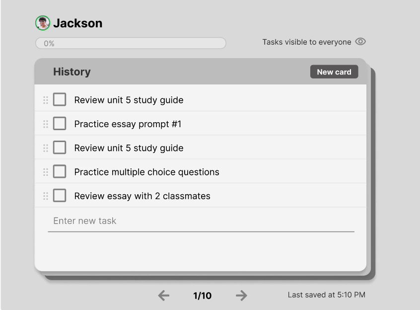
Version 1: Complete vs. not complete in list view
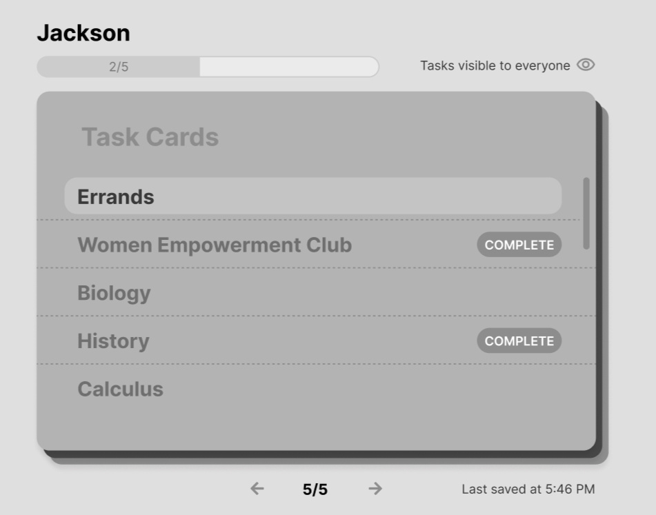
Deleting task cards: can be done on each individual task card as well as list view
Users preferred circular progress bars for each task card in list view and also indicated when a task card is complete, so the two versions above were combined.
Key Exploration: Aggregate/list view of tasks, last saved notifications, delete option for task cards
Usability Session
Validating designs
Objective:
Evaluate how students interact with task cards, focusing on understanding core components (task privacy, last saved), navigation between task lists, and accessing the aggregate/list view.
Key Results (7 users):
Users willingly split tasks into separate cards and created new cards.
The delete option was easy to locate.
Relative timestamps were well-received.
4/7 students found the list view difficult to locate.
The list view surprised students with its functionality, even if it didn’t fully meet their expectations.
Design iteration
Improved Usability
To access the list view, the background behind "1/10" was enhanced visually to look like a secondary button, making it look more clickable and discoverable.
User feedback: 80% of users found the list view more intuitive and easier to navigate.
Final Iteration
Added Flexibility and themes
I explored expanding the color palette from our current theme of colors and added monochromatic options, and also prioritized accessibility by testing color contrast ratios by using WebAIM contrast checker to validate the color choices
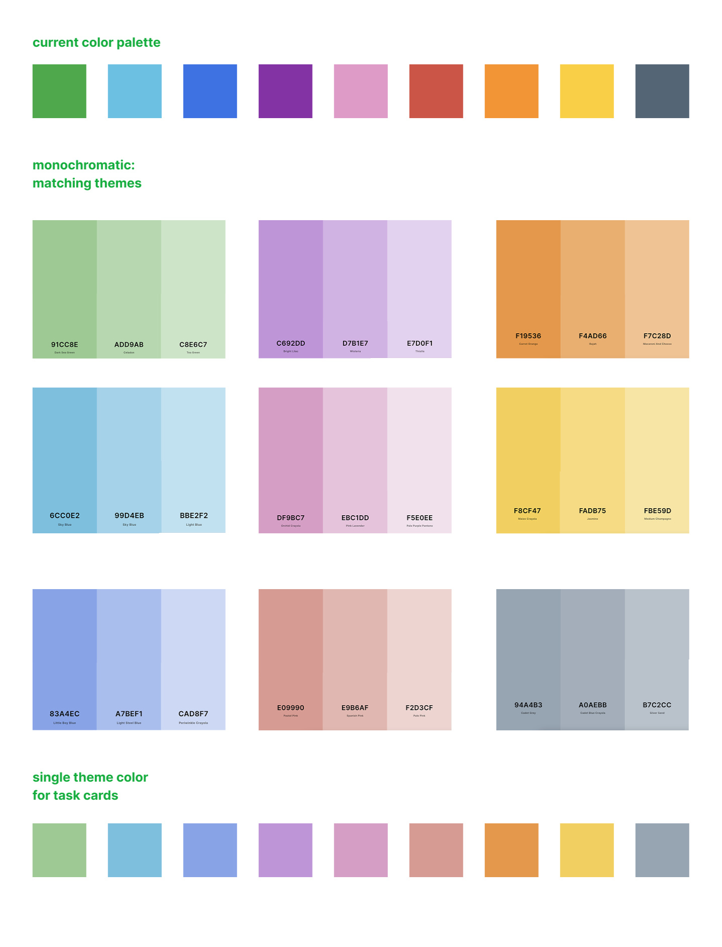
Adding colors, like monochromatic schemes, can improve organization and make it easier to distinguish between task cards. These color settings can be customized in the options menu.
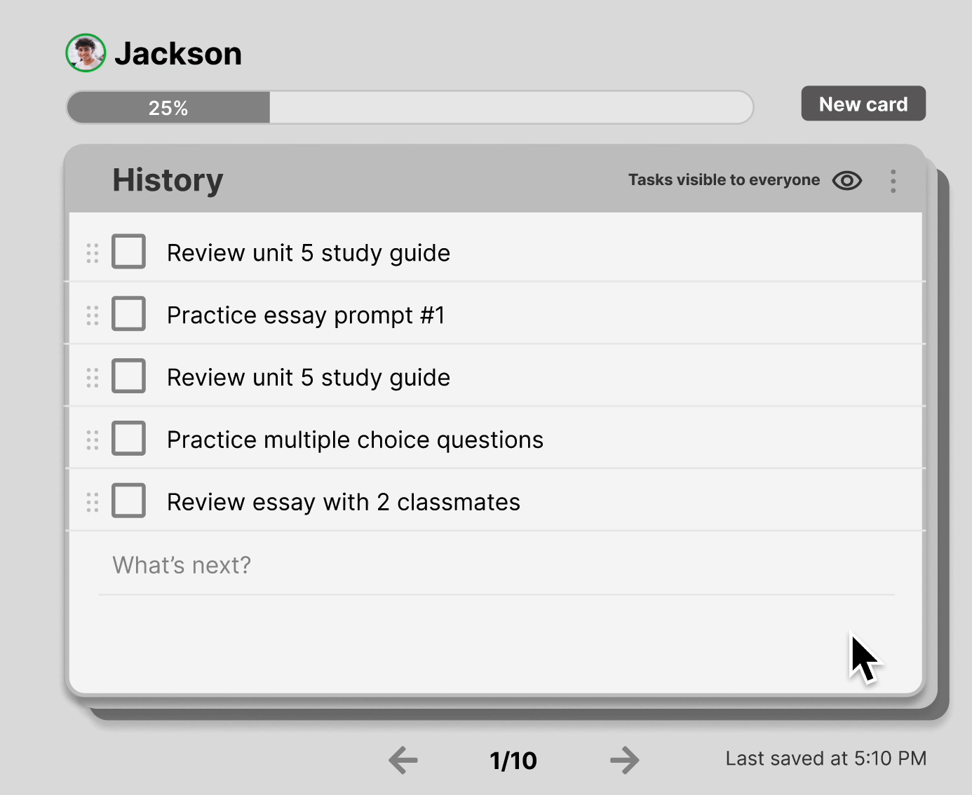
High-fidelity designs
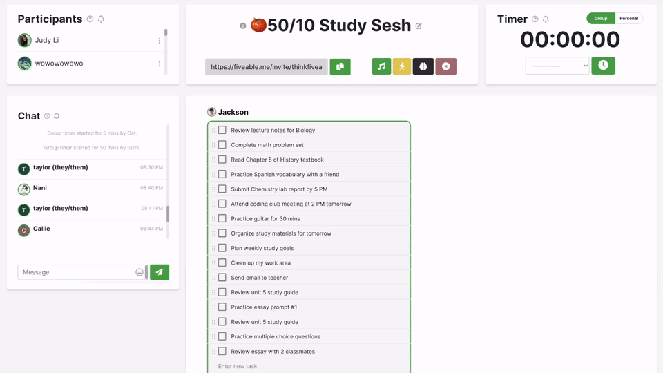
Elements of task cards
Add tasks and navigate between task cards
The goal was to prototype task cards animating to slide behind or in front of each other so engineers have a visual reference for adding tasks and shuffling animation.

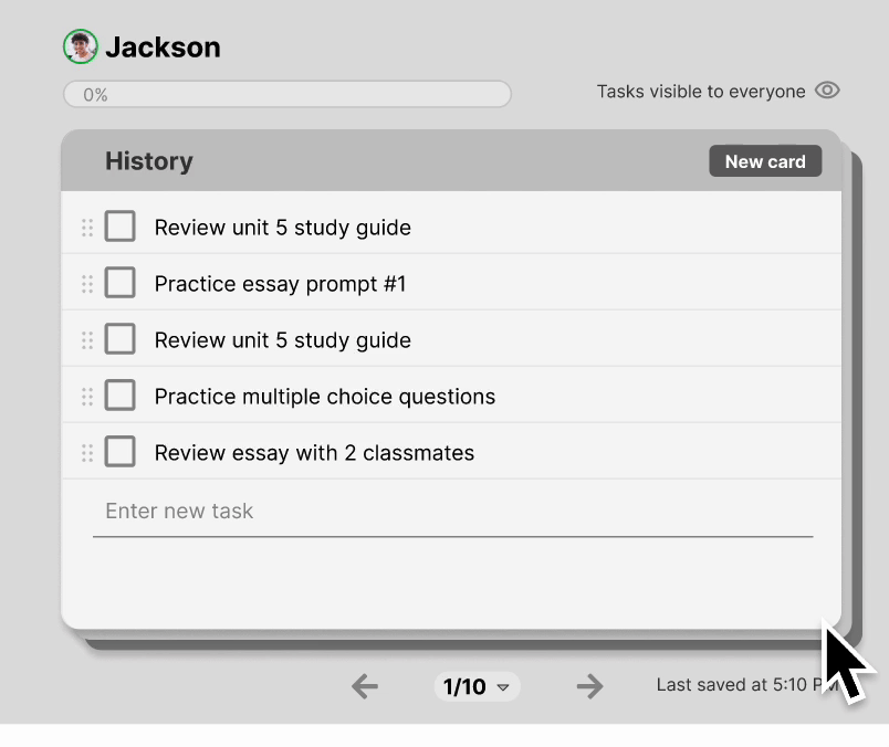
Accessing list view
The list view, accessible at the bottom, shows your current task card (e.g., 1/10) and lets you navigate to any card with a slide-up animation.
Privacy and settings
When the privacy setting changes, the background behind the title card updates to reflect the new state. Also, here’s a preview of the delete card option and the ability to assign colors to each task card.
High-fidelity designs
Task list in a session
High-fidelity designs
List view in a session
Final User Testing
Testing & validating final designs
We conducted usability testing with 10 participants for the final designs. Feedback indicated that 90% of users found the progress bars helpful, and 80% reported that the new task grouping feature reduced their cognitive load.
Data Outcomes
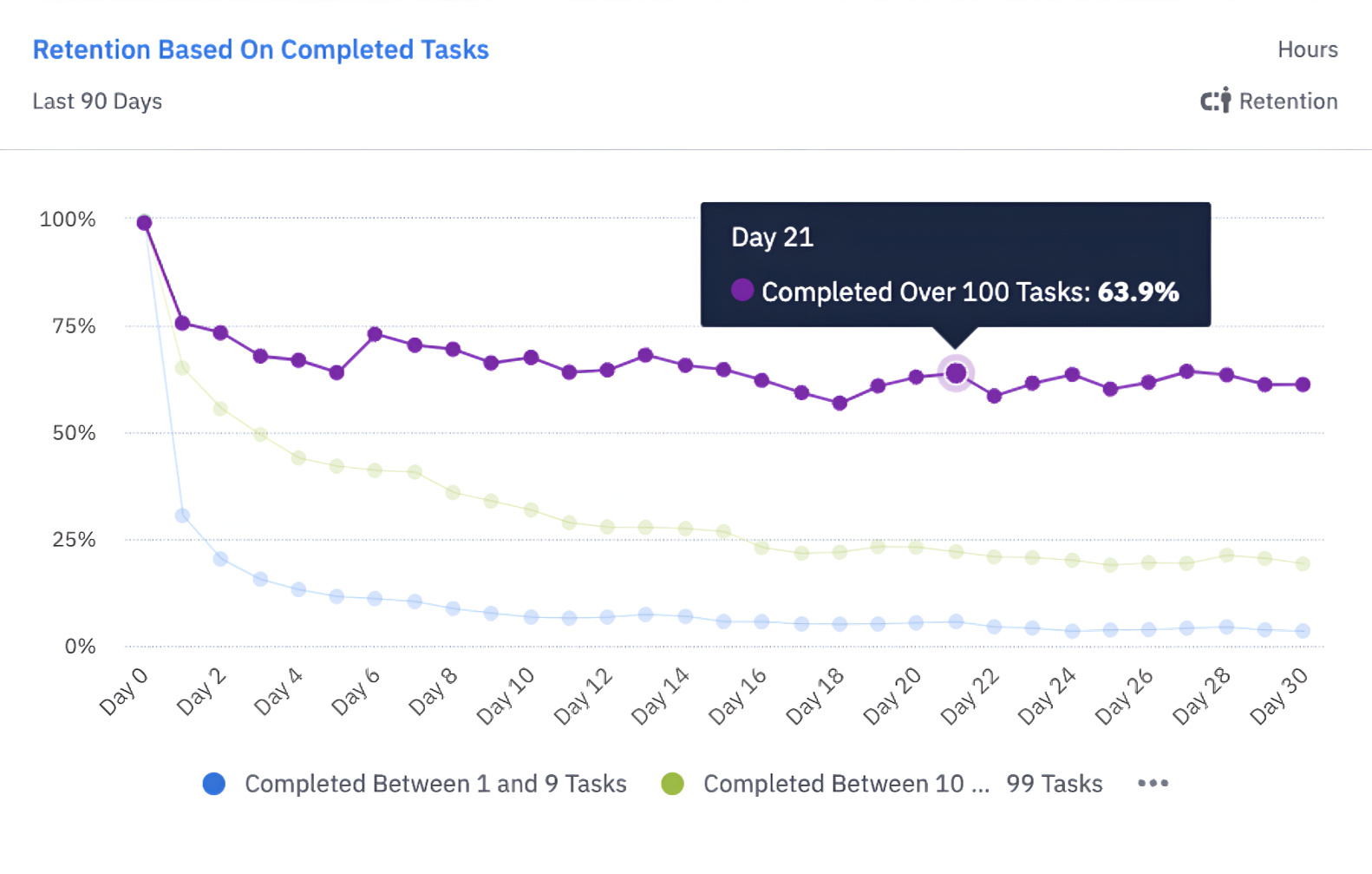
Task card metrics
Just 60 days after launch, task card interactions jumped from 43.1% to 73.1% of users, showing people are engaging more with the core features. For new users, interactions climbed from 23.4% to 37.5%, meaning more people are adopting the feature.
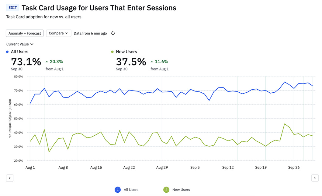
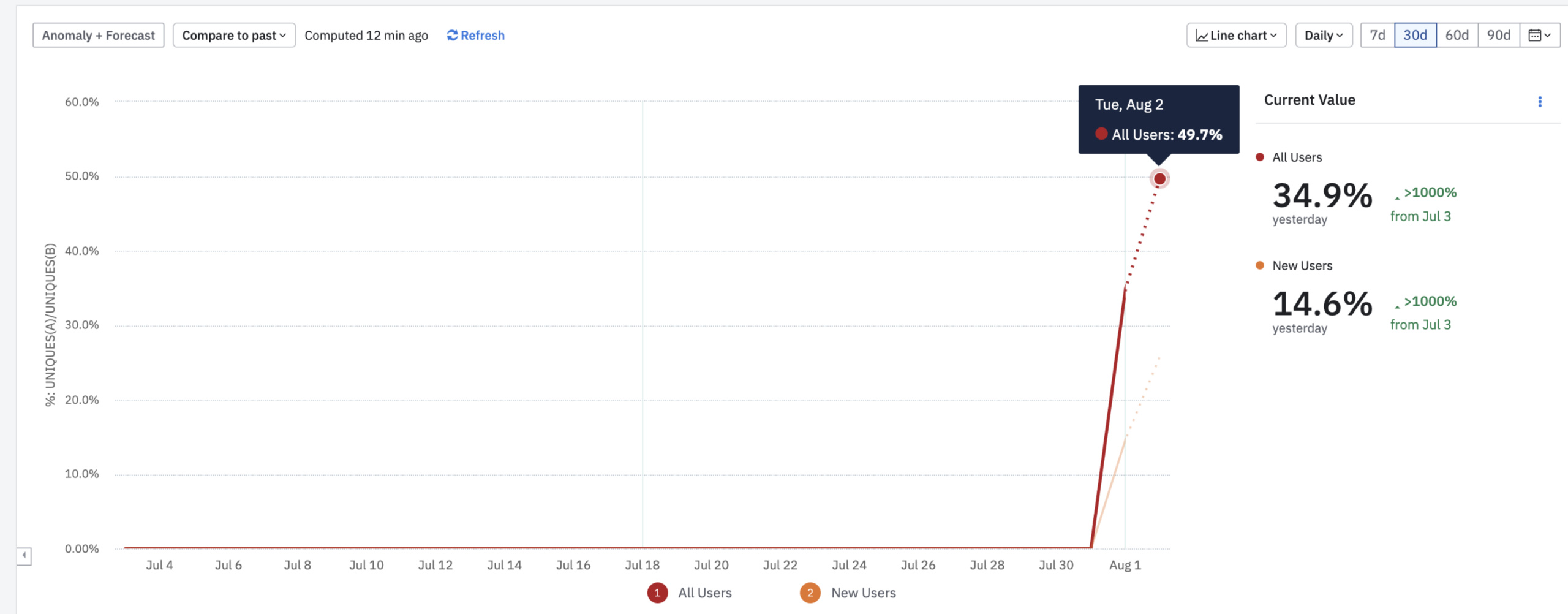
There was high early adoption, within the first few days, 50% of all users who viewed session pages interacted with task card features—already surpassing the pre-launch baseline of 43.1%. For new users, this adoption rate was 25.8%, indicating immediate interest and usability.
Learnings & Reflection
What I learned
Structured feedback sessions with teams from engineering, product, and design was helpful. They helped evaluate ideas, tackle technical feasibility, and make tradeoffs. Collaboration with engineers clarified constraints, like how a carousel view would be harder to integrate than task cards.
This project helped me better balance user needs with technical constraints by ensuring that task cards were intuitive for users while maintaining a unified view of their tasks and progress.
Next time, I would try to speed up the timeline by combining async feedback with live sessions to iterate on designs faster.
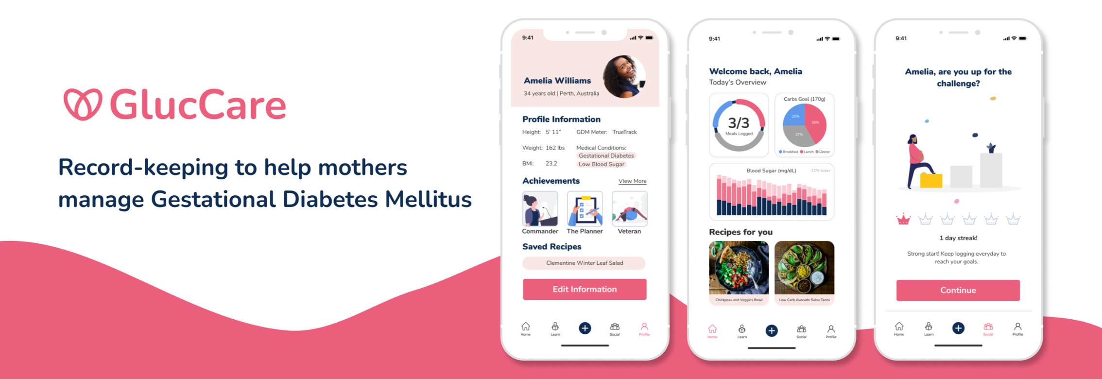
Glucare | Mobile App
Overview
Timeline
48 hoursRole
Lead DesignerTeam
2 UX Designers & DeveloperTools
FigmaResponsibilities
Product Strategy
User Research
UX Design
UI Design
Prototyping
Empowering mothers to navigate GDM
I wanted to challenge myself to solve a real-world problem under tight deadlines so I joined the UX Result Designathon. Out of three challenges, I was immediately drawn to the one about Gestational Diabetes Mellitus (GDM) because I’ve seen how difficult pregnancy can be, and adding a condition like GDM would only make it harder for new moms.The problem was presented directly by Tony Ma, CEO of Benten Technologies, who is passionate about this issue. Then, I teamed up with three other like-minded individuals.

Why is it so hard for mothers to stick to the necessary lifestyle changes, and how can design make this process easier?
Design Process
Creating a strategic game plan
With such a tight deadline of 48 hours, I jumped in and mapped out a game plan to keep things moving and organized. I streamlined the design process by overlapping tasks to save time—like combining research with defining the challenge and product goals, and pairing ideation with branding. Tasks were assigned according to each team member's strengths, and I encouraged the team to experiment and step outside their comfort zones.
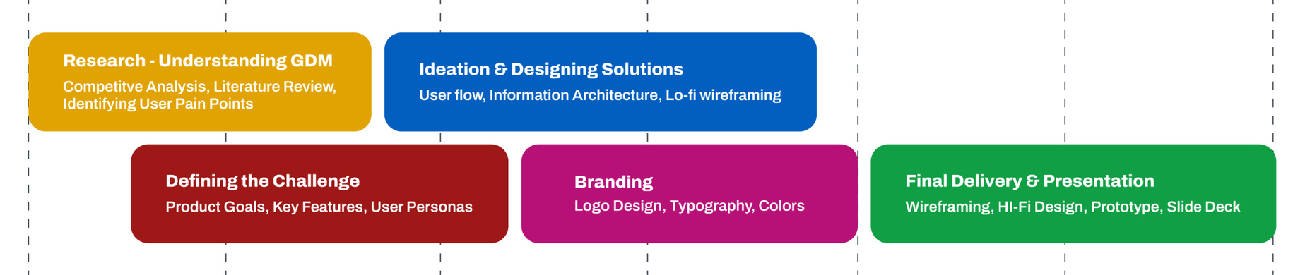
My focus was to work on food logging features and taking on logo design. In the end, we worked together to deliver high-fidelity designs, prototypes, and presentation slide deck to showcase our solutions to the CEO.
Research & Insights
Understanding our users (GDM Mothers)
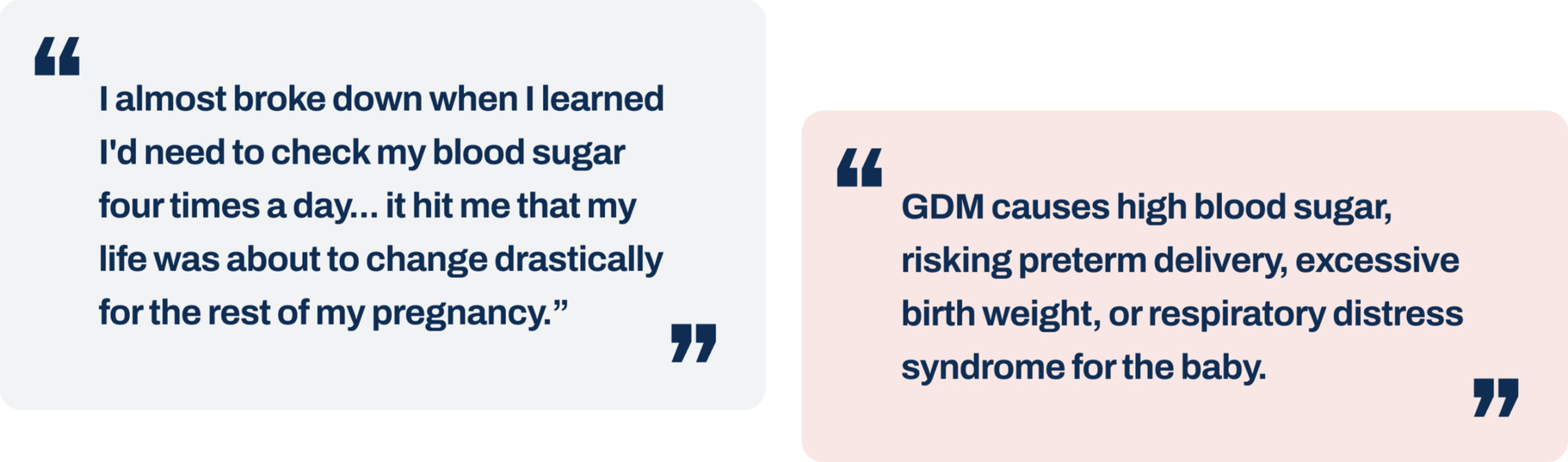
Insights from medical journals
Gestational diabetes can feel overwhelming, especially for newly diagnosed moms. It requires lifestyle changes, such as recording blood sugar levels and recording meals.
Learning from competitors
To better understand what was out there, we analyzed competitors like Glucose Buddy, MyFitnessPal, and Fitbit. Personally, I focused on MyFitnessPal, as I was a regular user and wanted to see if any of its features could support gestational diabetes.
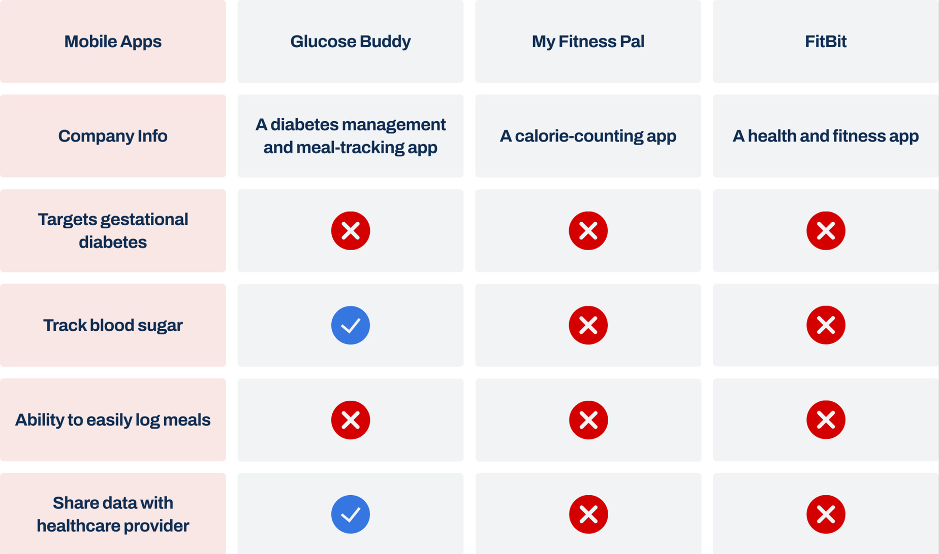
I summarized all the findings into a chart and documented the metrics.None of the apps are designed for gestational diabetes, despite offering health and meal tracking. Common issues include tedious meal logging, lack of blood sugar tracking, and limited ways to share data with healthcare providers—highlighting a gap in solutions tailored to GDM.Metrics:
100% of apps log meals, but none make it easy
0% target GDM
33% track blood sugar
33% allow data sharing with healthcare providers

Disclaimer: The photos above are placeholder images and do not represent the actual interview participants. All participants' identities and personal details have been kept confidential.
Interviewing GDM Mothers
Participants: 3 GDM mothers
Questions:
How do you currently track your meals and blood sugar levels?
What challenges do you face when logging your meals?
How does the process of meal logging make you feel?
Have you ever skipped logging meals? If so, why?
Interview Insights & Quotes:
66% of GDM mothers struggle with meal logging because they had to manually track their meals, often forgetting to track them
"I often skip logging meals because it’s too overwhelming to track everything while trying to take care of myself, get ready for motherhood, and just keep up with life."
"I feel like I’m doing this all alone. It’s hard to stay motivated without support or others who understand what I’m going through."
"I don’t always know what to eat or how to plan meals that fit my needs. It’s difficult to figure it out on my own."
Refining the problem
We decided to focus on meal logging since it’s the main pain point for managing blood sugar and a primary challenge for GDM mothers. We should also address the lack of motivation, community, knowledge, and recipes to make the process less overwhelming and more supportive.
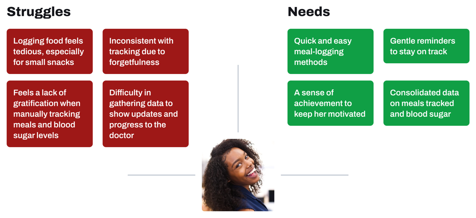
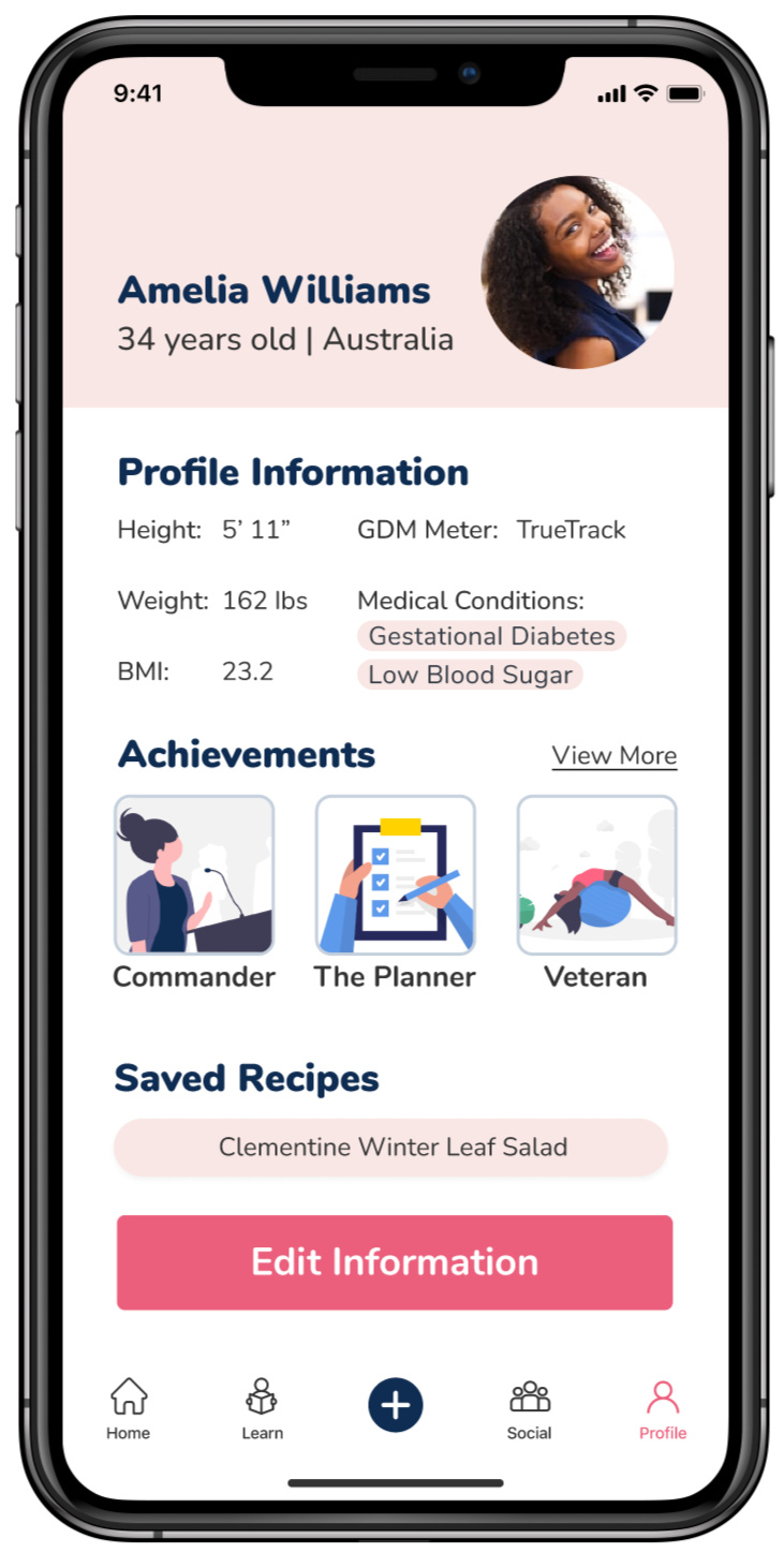
User Persona
Meet Amelia—a GDM mother
We synthesized our research insights and mapped struggles and needs to ensure our design directly addresses them for Amelia, a first-time mother with gestational diabetes (GDM).
Defining goals
Turning a burden into a habit
We chose to develop a mobile app for on-the-go convenience. We started with a rapid brainstorming session to generate ideas:
Food tracking
Barcode scanning for packaged foods
AI-powered image recognition for meals
Voice recording for logging on-the-go
Motivation & rewards
Achievement badges and milestones for consistency
Social feed showcasing achievements with other GDM mothers
Education
Suggest articles to help education mothers on GDM
Include recipes that are GDM-friendly
Ideation
Initial sketching & wireframing
Next, I started sketching out initial wireframes, exploring screens like the dashboard, food logging, social and community features, as well as educational content.
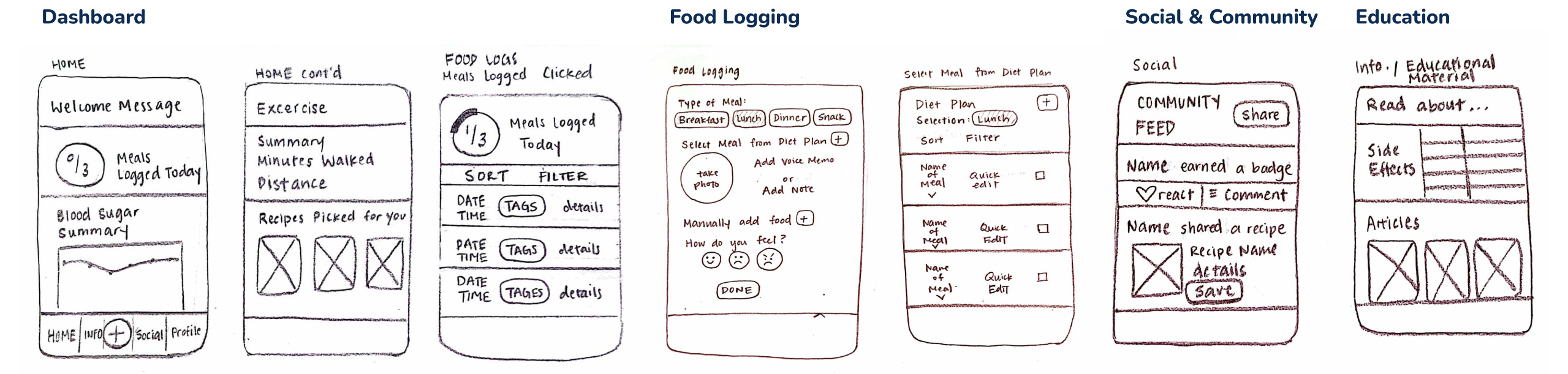
User flow
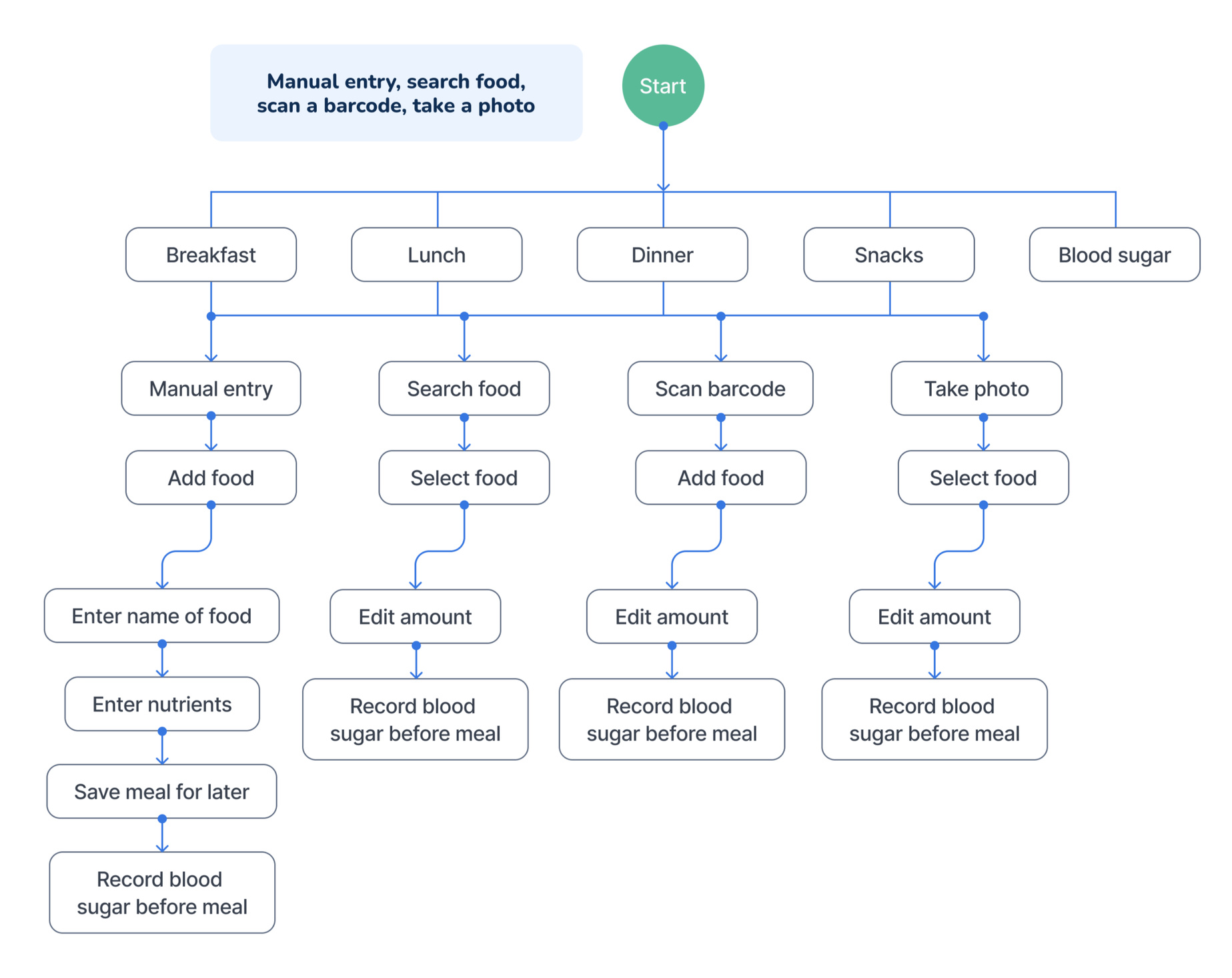
Food logging pathways
As a team, we mapped out the food-logging pathways and realized they would be extensive.
Feedback session
Feedback meeting with the CEO
We started to face a roadblock so I took the initiative to set up a meeting with the CEO for a feedback session. He was excited about our app concept, highlighting how it stood out from other teams by directly addressing the core challenges. He then shared the following feedback:
How can we refine the dashboard to highlight the most important statistics for managing GDM?
How can we clarify the navigation elements to make each section more intuitive?
How can we design the pathways and mechanisms for mothers to input food more effectively?
User flow revised
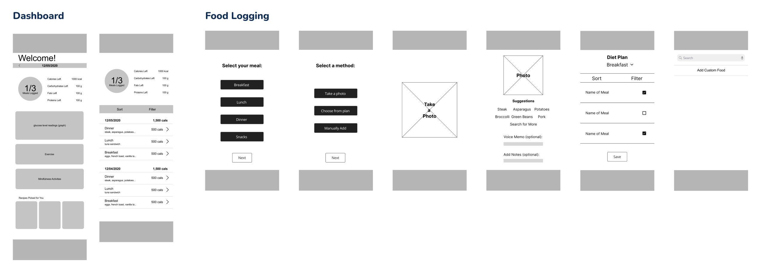
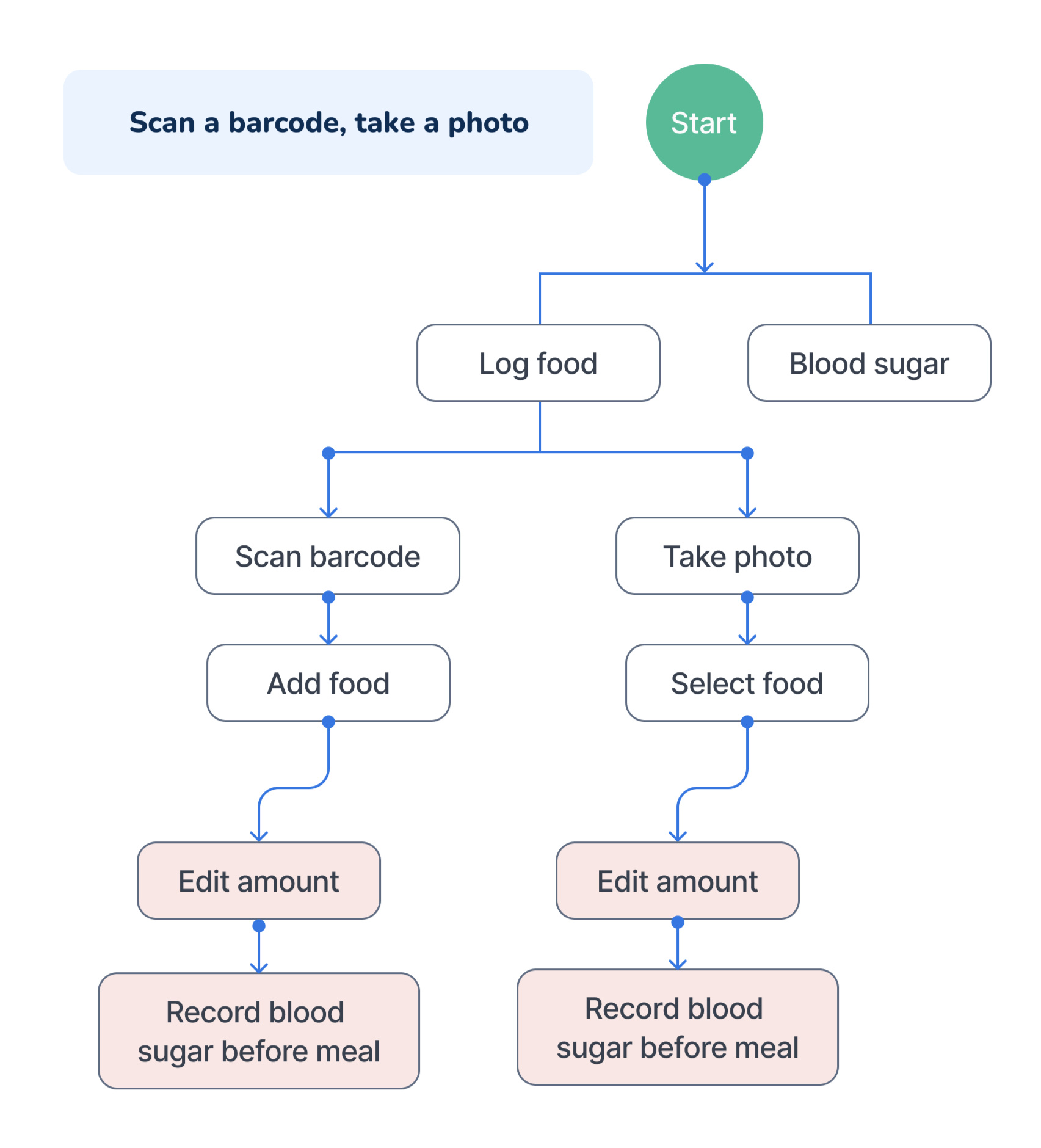
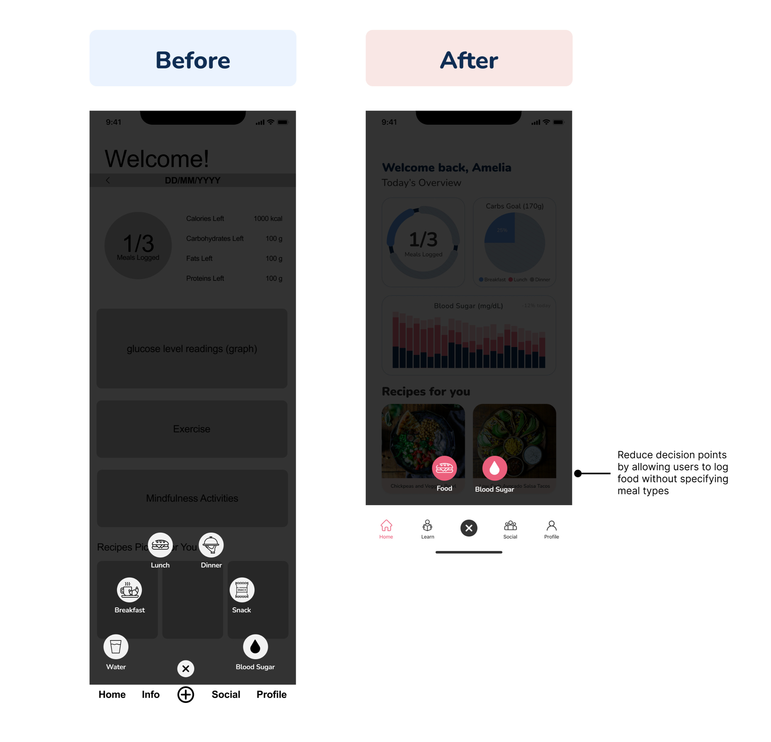
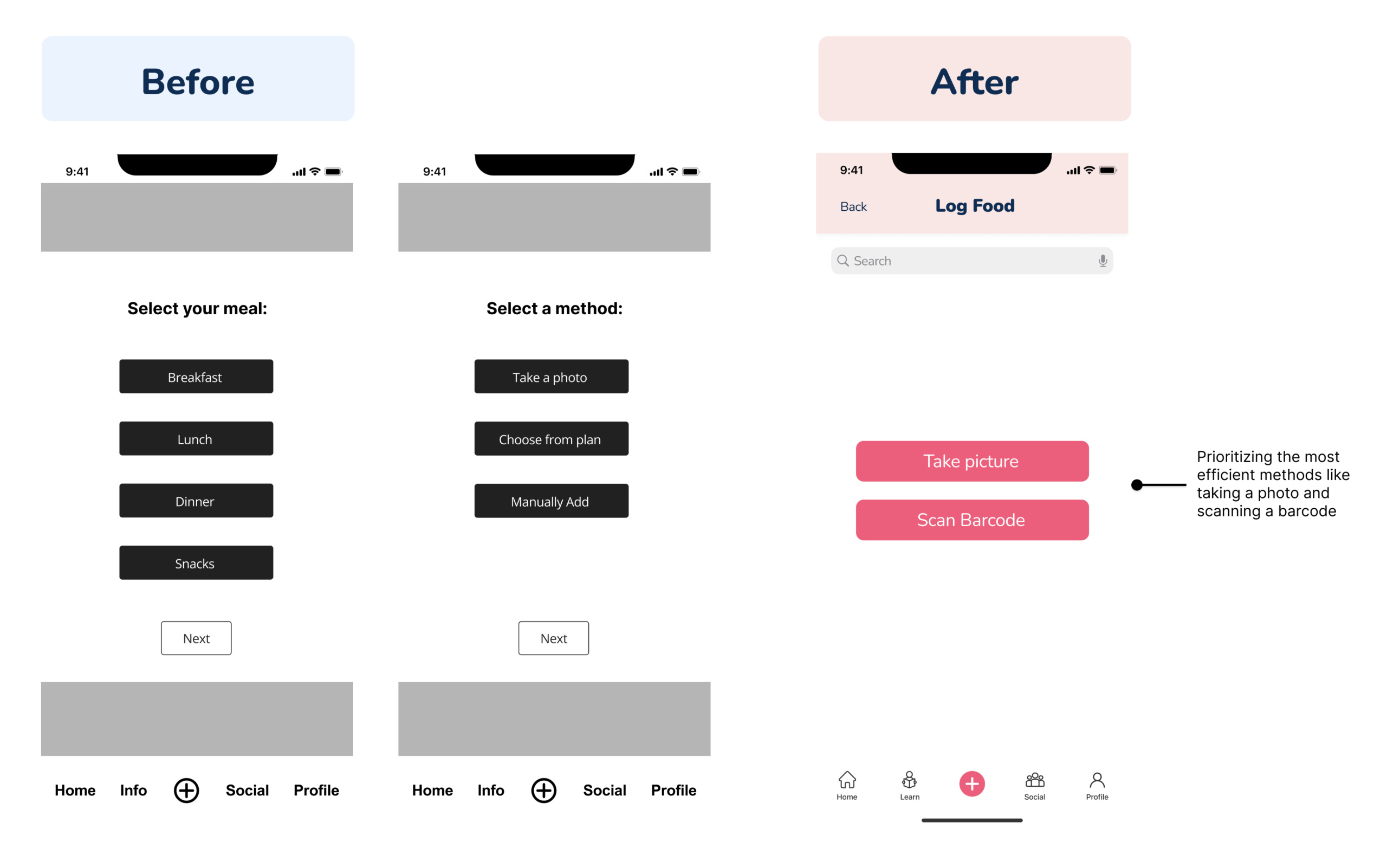
Streamlined food-logging pathways
We streamlined the user experience by prioritizing efficient methods like barcode scanning or photo capture over manual forms of entry, consolidating repetitive actions into reusable components, and reducing decision points by enabling food logging without upfront meal type specification or inferring meal types based on time of day.
Wireframes revised
Addressing feedback from the CEO
Branding
Setting the tone for the brand
To maintain consistency and to resonate with our target audience of mothers, we selected the following inspiration words for our branding: soft, feminine, and comfort.
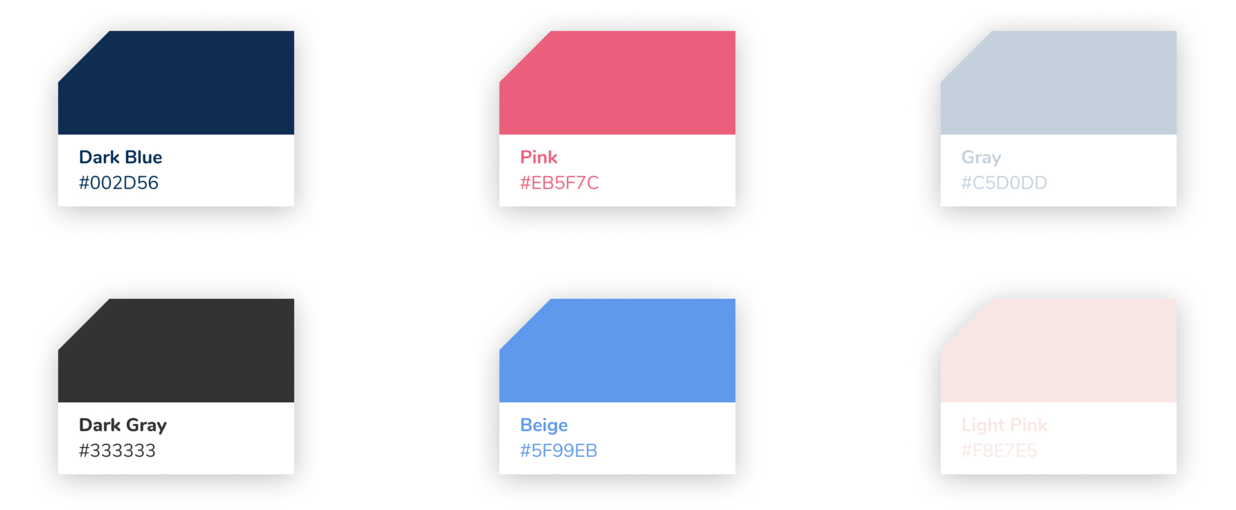
Color palette
Typography
Nunito’s rounded style aligns with the brand’s tone while ensuring strong readability.
High-fidelity designs
Journey through the app
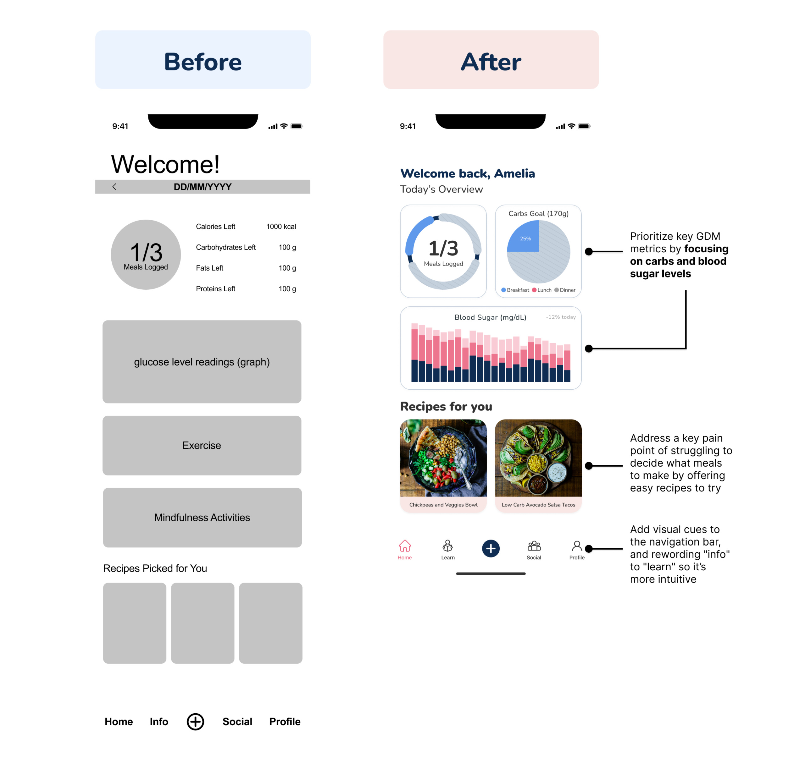
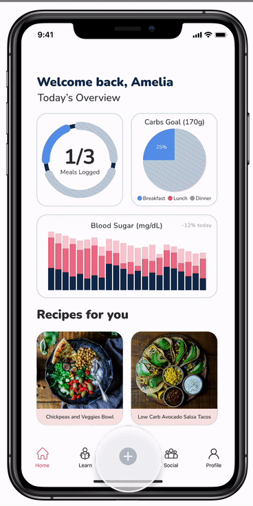
Dashboard
The dashboard shows a summary of your daily logged meals, tracks carb goals and blood sugar levels, and recommends GDM-friendly recipes to try.
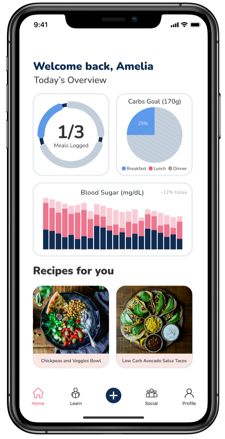
Food-logging
Log your daily meals effortlessly by snapping a photo or scanning a barcode, and it’ll automatically calculate and save the nutritional information.
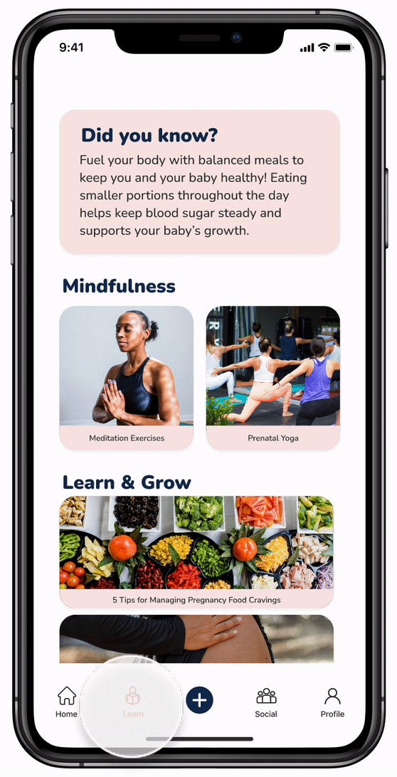
GDM Education
The Learn Tab has helpful guides on managing nutrition, tracking blood sugar, learning about GDM, and exercise tips.
Profile
Stores key medical details, like existing conditions and health information, to help personalize your care.
Learnings & Reflection
What I learned
Trusting my guts to meet with the CEO was crucial; he provided valuable insights that helped shape the app by guiding us to prioritize core features and to simplify the experience.
Developing a persona allowed for deeper user empathy (we found ourselves referring back to it throughout the project) which ensured the designs were addressing real user challenges.
Working within a tight timeframe taught me to make confident and timely decisions so we could stay on track and have a final deliverable.
Measuring and defining success
To gauge effectiveness, we would focus on tracking the following metrics:
Engagement rates such as daily and weekly active users, and time spent in the app, as well as percentage of users logging meals for at least three months
Retention rates when a user returns day after day, week after week, month over month
Health outcomes by getting user feedback on blood sugar control and levels of stress